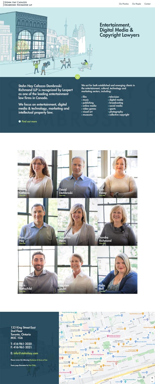
Best Lawyer Website Designs for 2021
This year we ended up surfing over 1500 lawyer websites to create the most complete list of the best lawyer website designs. Our team handpicked these winners and personally reviewed them. The list includes the best law firm websites, and while we are generally design driven this year we’ve also used Google to benchmark the sites for both desktop and mobile performance. We want to see equal parts beauty and performance when it comes to the design and development of the best lawyer websites.
Please take a moment to review our lists of the top legal websites for 2021 or take a look back at our best lawyer website collections.
Need help with your Lawyer Website Design?
Kyle Godon is our legal marketing expert. He’s personally helped over 128 lawyers and he will help you attract ideal clients for your practice.
89% Overall Performance Rating
Performance: 88% / Accessibility: 98% / Best Practices: 79% / SEO: 90%
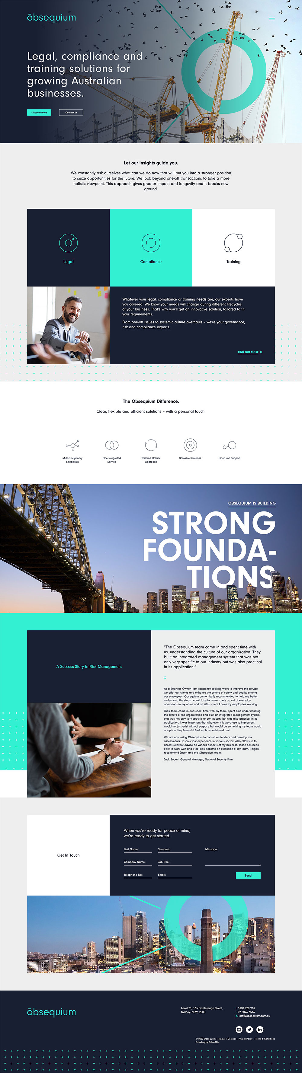
Why we liked Obsequium
“It’s immediately clear that this site was well designed, you can feel the value in their branding design thoughtfully extending into their website. A lot of times you’ll see a really strong brand fall flat online, this isn’t the case here. The branding is punchy, unique and everything is readable. One knock is the lack of https but overall this is my top pick for 2021.” – John
“I’m a sucker for good branding and punchy colours. The Obsequium site balances personality and simplicity to a T and I would think that really drives home for potential clients with having a sense of the Firm right off the bat.” – Taylor
“Obsequium’s website hits all of the right notes when it comes to layout, branding, and content. The heavy focus on blocks to construct the layout of each page makes it easy to follow and seamlessly transition to mobile. My only criticism would be that some of the copy throughout the site feels a bit on the small side, but beyond that this site is excellent.” – Scott
“The “Our Approach” section is a neat way of visualizing the client process: Get Insights, Strategise, Implement, Optimise. This would work really well for other processes like family mediation, setting up a business legally, or the criminal law process.” – Kyle
88% Overall Performance Rating
Performance: 84% / Accessibility: 84% / Best Practices: 93% / SEO: 92%
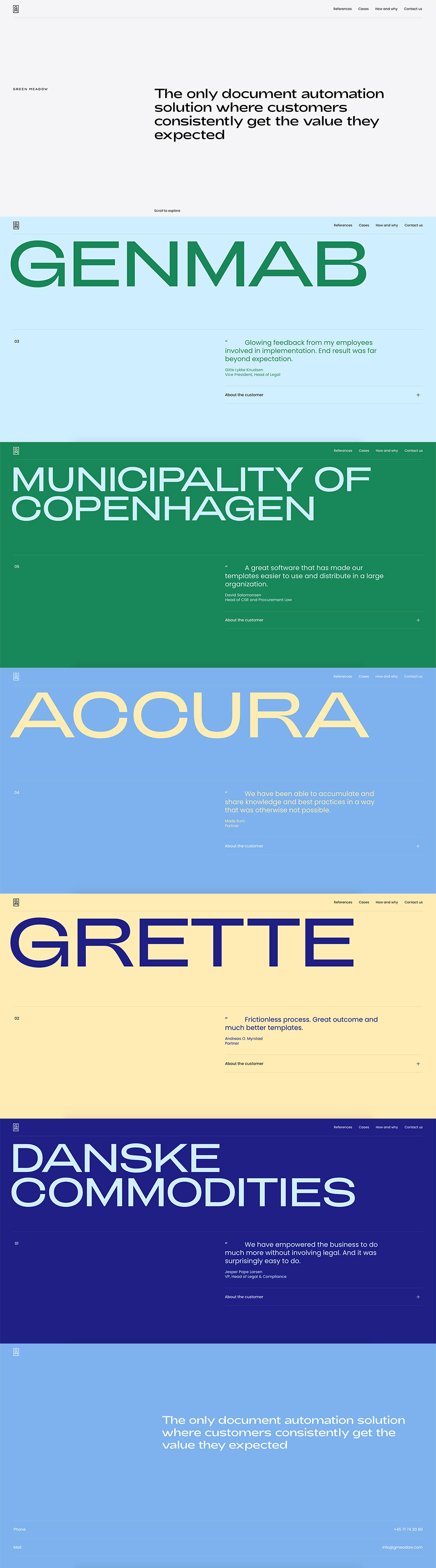
Why we liked Green Meadow
“A very interesting design approach where you get these swiping panels of bright colours and a unique font. It’s a perfect fit for a legal practice which specializes in modernizing document review and creation.” – John
“So not your typical lawyer website, and for that – whew. This one is so slick and modern it may not be obvious what kind of business they are at first, but with the simple headlines and short body copy it allows you to focus in and only read the good stuff before browsing for more information.” – Taylor
“This website is the definition of slick and minimal. The panelled approach is supported by the strongest typography and colour palette of any website on our best lawyer website designs for 2021 list. More than any other site on our list, this one feels as if it carries nothing extraneous. The direct and sole focus on customer reviews on the homepage is a unique approach that other law firms with established reputations may want to consider.” – Scott
“Without a doubt, this is the most unique website I’ve ever seen for document drafting. Anyone who is browsing different providers online will certainly remember this firm.” – Kyle
73% Overall Performance Rating
Performance: 48% / Accessibility: 72% / Best Practices: 79% / SEO: 93%
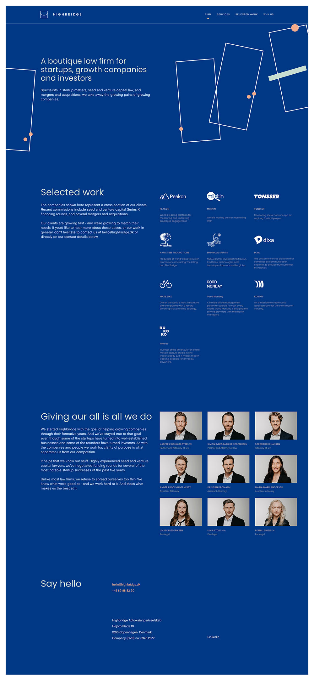
Why we liked Highbridge Law Firm
“I love that they created a succinct intro statement about who they are and what they do. The tech-style animations make them feel like a modern firm. It’s memorable for all of the right reasons.” – John
“The flow of content and animation really stick out with Highbride Law Firm’s website. Colbolt blue is really having a moment here and I think it is allowing a law firm to feel modern and ‘with the times’. The simple layout from homepage to interior pages really seem… too? simple? But with the deep background it somehow all works so well.” – Taylor
“Highbridge’s website demonstrates a strong sense of identity through a simple and easy-to-follow design, well-thought out content structure, and attractive branding. I love that all of the copy on the homepage is aligned; this makes the site extremely easy to skim as not much movement is required for your eyes to read everything.” – Scott
“The Who We Are and Who We Help is crystal clear right away. I think site visitors will appreciate knowing they are in the right place moments after visiting the site.” – Kyle
66% Overall Performance Rating
Performance: 17% / Accessibility: 91% / Best Practices: 71% / SEO: 86%
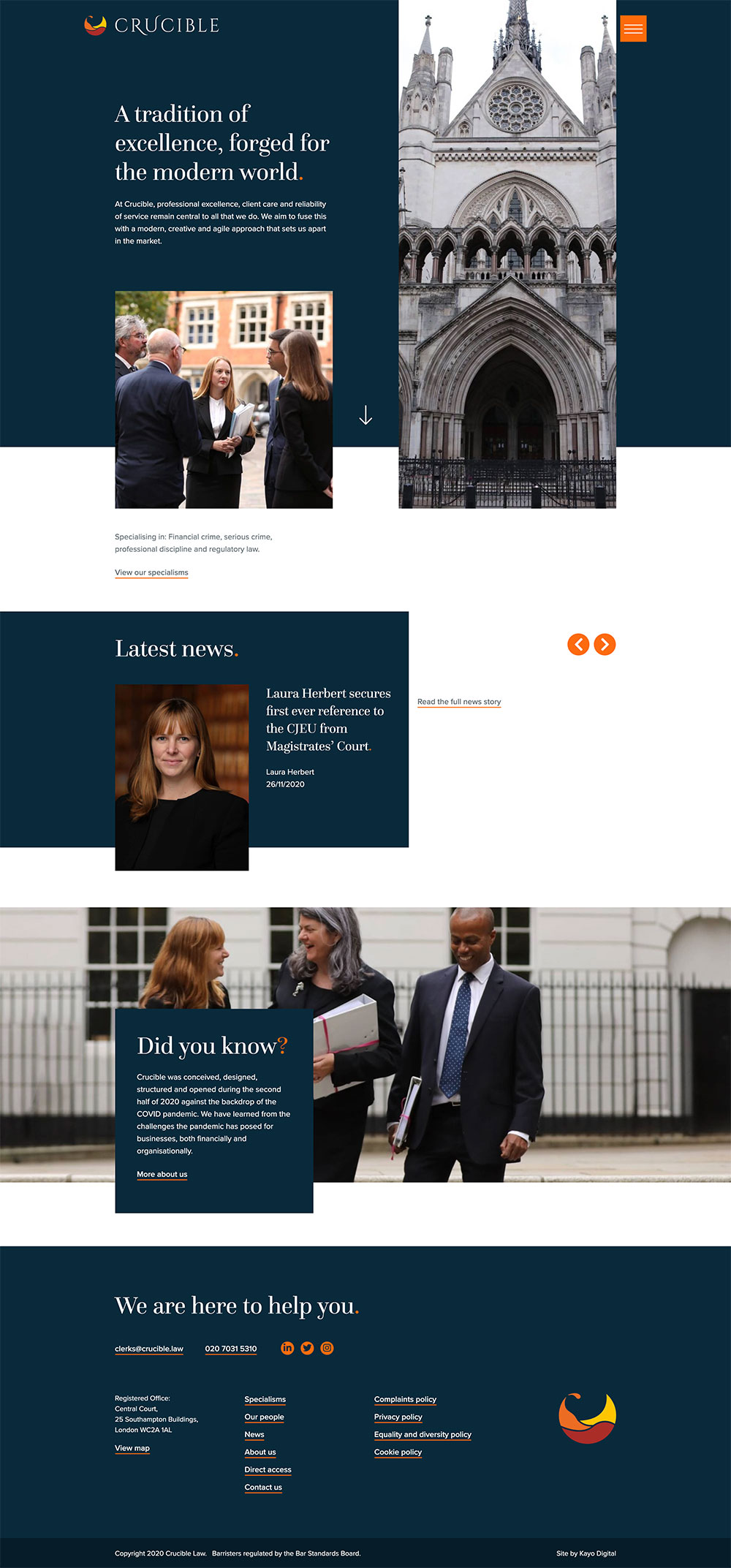
Why we liked Crucible Law
“First thing that stands out is the unique logo. Maybe that’s a good thing because the page felt a little slow to load so the logo kept my attention. Overall I think it’s a well structured and not overly designed site which is a good option for a London based law firm looking to service the ‘modern world’.” – John
“Prefacing this one with the fact that I think some key sections of the homepage are missing, at least it looks that way. We added this site to the list because the branding is just so good. The fixed elements help modernize it while the font and colours allow it to stand out. Also really enjoyed their open menu design, too.” – Taylor
“The layout of Crucible’s website is dynamic and engaging through its use of overlapping blocks and sharp light and dark colour divisions. Yet, it doesn’t feel overwhelming to navigate due to strong typography and clear link styling. – Scott
“I love the little pointer that hovers over the photo of the Latest News section to indicate that scrolling left or right will reveal more articles. Easily understood, very obvious, but doesn’t interfere with the image.” – Kyle
70% Overall Performance Rating
Performance: 39% / Accessibility: 79% / Best Practices: 71% / SEO: 92%
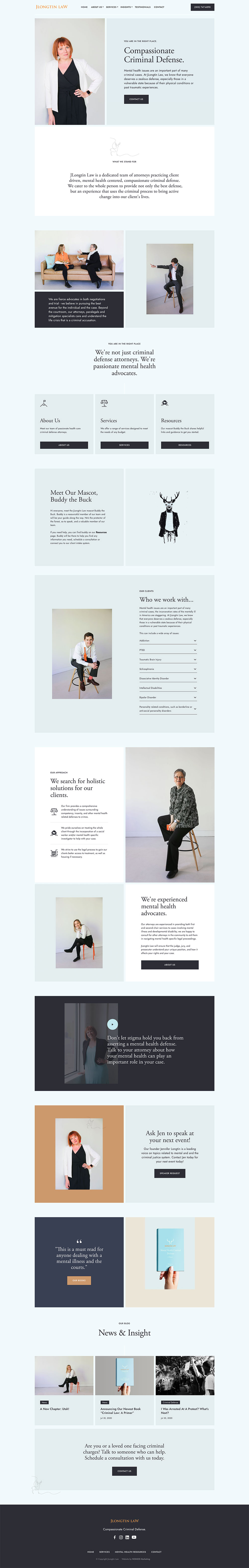
Why we liked JLongtin Law
“This is a refreshing website. It’s not trying too hard. At the same time you know that some quality thinking went into the design. It makes me feel comfortable and answers my key questions with ease. It’s probably not going to win most traditional website design awards, but this is the best law firm awards roundup and as such this site deserves a spot.” – John
“This one is simple, timeless and just so good. Some websites focus so hard on the newest animations and elements to stand out. JLongtin Law is the perfect example of while all of that stuff is nice — a strong brand and design are really all you need to have a great online presence. – Taylor
“You can definitely feel the care and attention that was put into the construction of this website and branding for the firm. Jlongtin Law comes across as being extremely friendly and personable due to the light colour scheme and frequent usage of staff photos. There’s also many nice hand drawn elements and vector icons throughout the site. However, my overall feeling is that it might just be a bit over-designed. The staff photos are great and I enjoy that they tried using different crops throughout the site, but they feel overused. And the typography is very nice, but simultaneously feels too complicated. I have mixed feelings about this one ultimately.” – Scott
“I really liked the content for this criminal defence website. Instead of boasting their qualifications, it feels like they’re really leaning in to let you know that they’re on your side.” – Kyle
6. KBA Law Firm
“Collaborating timeless elements with modern interactions”
Designed by Kommi Graphics
91% Overall Performance Rating
Performance: 85% / Accessibility: 96% / Best Practices: 86% / SEO: 100%
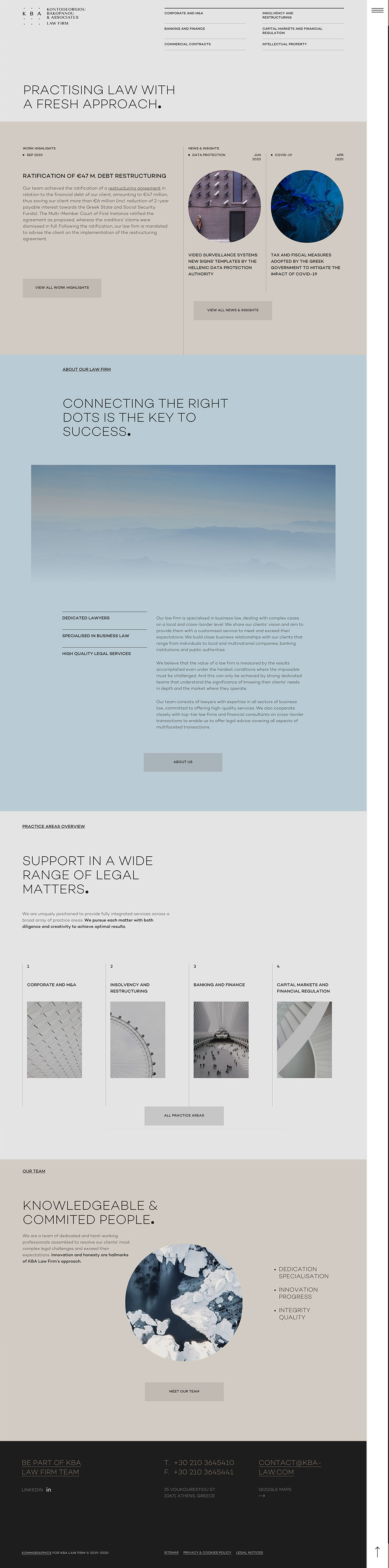
Why we liked KBA Law Firm
“This one stands out to me. It has a really strong conceptual design which I feel like probably looked much better in print or in the mockups. It’s very unique and cool but it leaves me wanting more. I think the developer kind of let the designer down here. I keep coming back to it though so it’s worthy of note.” – John
“I agree with the strong conceptual design being the big factor here. Yes, this site is beautiful, the soft hover effects and moody colour scheme tie in so perfectly. However, as you really focus in on the sections there is room for improvement through type and layout. All in all, this site is such a modern approach to legal websites and I think it’s definitely worthy of being on our list this year!” – Taylor
“Love the subdued colour scheme of this website for KBA Law. The sidebar hamburger menu is also quite unique and memorable. The breakdown of each section on the pages of their site by colour works well to keep things easy to follow. The animations used throughout might be a bit too much for my taste, but overall its certainly one of the best lawyer website designs of 2021 in my books.” – Scott
“Smart, abstract use of stock images is a great way to avoid the common images of people in conference rooms that most law firms say they want to avoid.” – Kyle
7. Lemonidis Consulting & Law Group
“Setting a hierarchy of information through branded layouts”
www.lemonidislaw.com
Designed by Beam Local
86% Overall Performance Rating
Performance: 76% / Accessibility: 97% / Best Practices: 72% / SEO: 98%
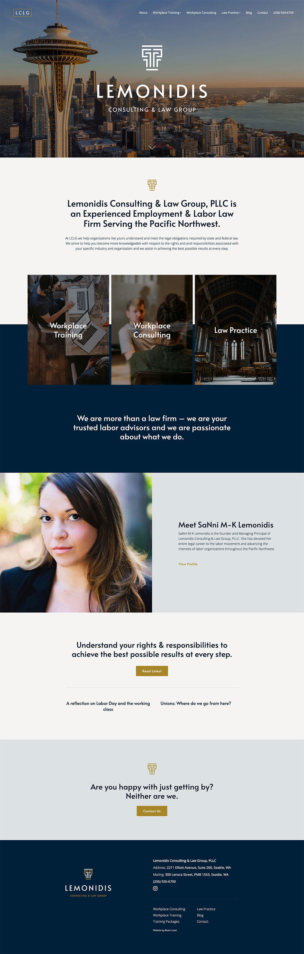
Why we liked Lemonidis Consulting & Law Group
“Sometimes you just need a modern, bold statement piece for your website. Nothing over the top, but something which will help you stand out in the crowd. It’s full of essential information, everything is organized well. It’s fast and works perfect on mobile. It’s great.” – John
“All the good things law firm websites should be. This website weaves in branding through colours, fonts, headlines and images while seamlessly having a guided hierarchy which is easily attainable for a user to browse.” – Taylor
“The two things which stand out the most to me on this website for Lemonidis Consulting & Law Group are the strong, classic branding and smart content structure. The homepage has just the right amount of content; it’s not so little that you don’t understand who they are or what they do and it’s not so much that you’re overwhelmed and don’t want to read anything. The feeling I get from this site is one of understanding and calm; two of the arguably most important qualities you should be looking to evoke in users who visit the website for your law practice.” – Scott
“This website always gets such a positive reaction from other attorneys. It’s not too outlandish and you can tell she put a lot of effort into her website which is indicative of the type of effort she puts in her legal services and client relationships.” – Kyle
72% Overall Performance Rating
Performance: 33% / Accessibility: 92% / Best Practices: 86% / SEO: 78%
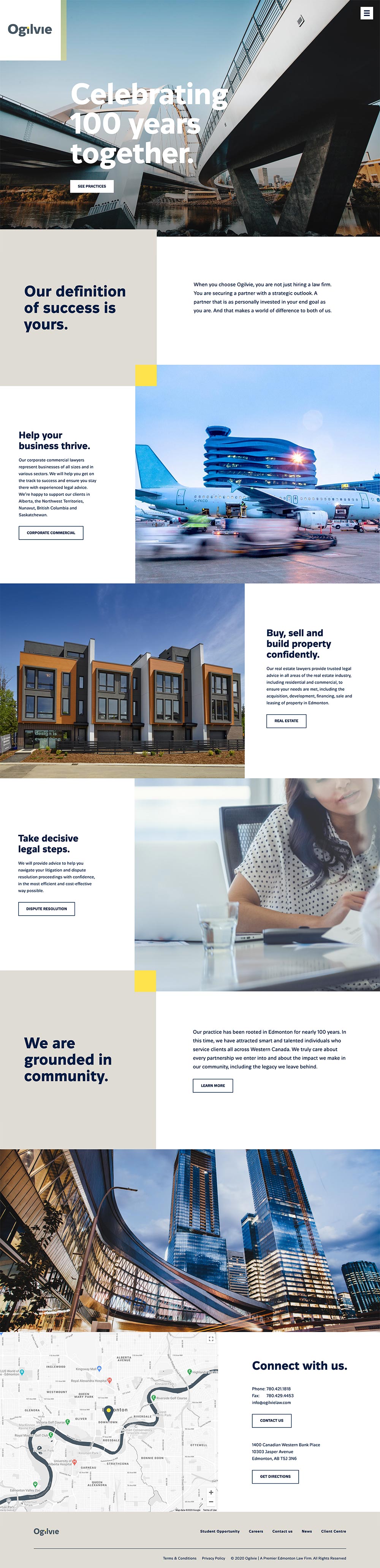
Why we liked Ogilvie Law
“This feels expensive to me. It has a very modern design, and it utilizes a wide range of interesting animations without becoming overdone or distracting. Personally I think animation should be kept to a minimum on sites and wish there was some integrated video content but it’s a very solid law firm website design.” – John
“Through type and fun animation on both the pages and the main menu, this site may be what most law firms think of when they set their goals on a new website. The boldness of all of the design elements actually seem too big for my design taste, however, its just bold enough for for a driven lawyer.” – Taylor
“Love the simplicity of the layout on this lawyer website and the skill with which the different sections on the homepage were connected through overlapping and animation as you scroll down. I also enjoy that the yellow square that is part of their branding is also weaved into the design in subtle ways throughout the site; this sort of visual cue is always a nice way to reinforce your identity on a more subtle level throughout any branded material you produce for your firm.” – Scott
“Big law firm with long-time roots in the Edmonton area, it’s nice to see that they went with a modern look-and-feel and avoided the traditional, conservative type of legal website.” – Kyle
9. Garcia de Souza
“A unique and interactive approach.”
www.garciadesouza.com.br
Designed by: Future Brand
71% Overall Performance Rating
Performance: 30% / Accessibility: 83% / Best Practices: 86% / SEO: 86%
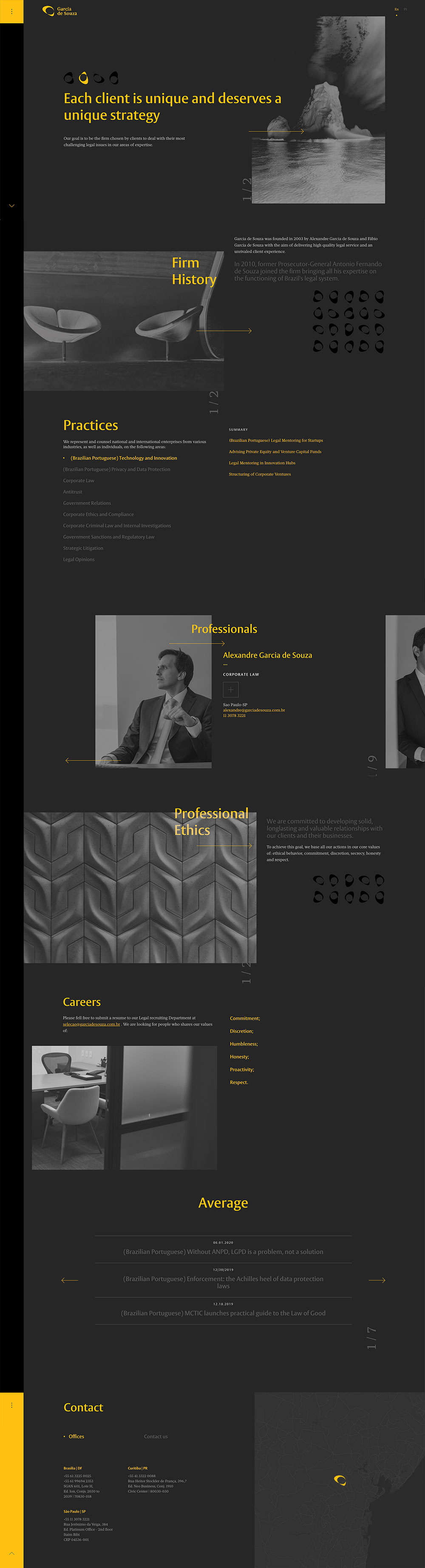
Why we liked Garcia de Souza
“I like coming across sites like this. It reminds me that the world is still large and there are ‘styles’ which emanate from certain areas. This site feels like it was designed in Brazil, which is a compliment. It’s cool, it’s different. Memorable.” – John
“This one is so different from the other we’ve added to the list and I think it is great! What we have here is a well branded website which hones in on animation, sections, and unique modern elements.” – Taylor
“The progress bar along the left-hand side of this lawyer website immediately stands out. There’s nothing else like it on our list, or any previous list of best lawyer website designs that I can recall. Typically you see these on some blog websites, but it’s a smart idea to try it out on their homepage. There’s something about having that versus simply having the standard scroll bar that makes me want to keep scrolling and see everything that this firm has to offer. It pairs well with the panelled approach of their homepage.” – Scott
“The ability to scroll sideways or up-and-down is neat, but I can’t see a lot of solo lawyers wanting this for fear of confusing site visitors and clients. I think most lawyers want a website that’s simple and easy to navigate.” – Kyle
66% Overall Performance Rating
Performance: 32% / Accessibility: 88% / Best Practices: 57% / SEO: 86%
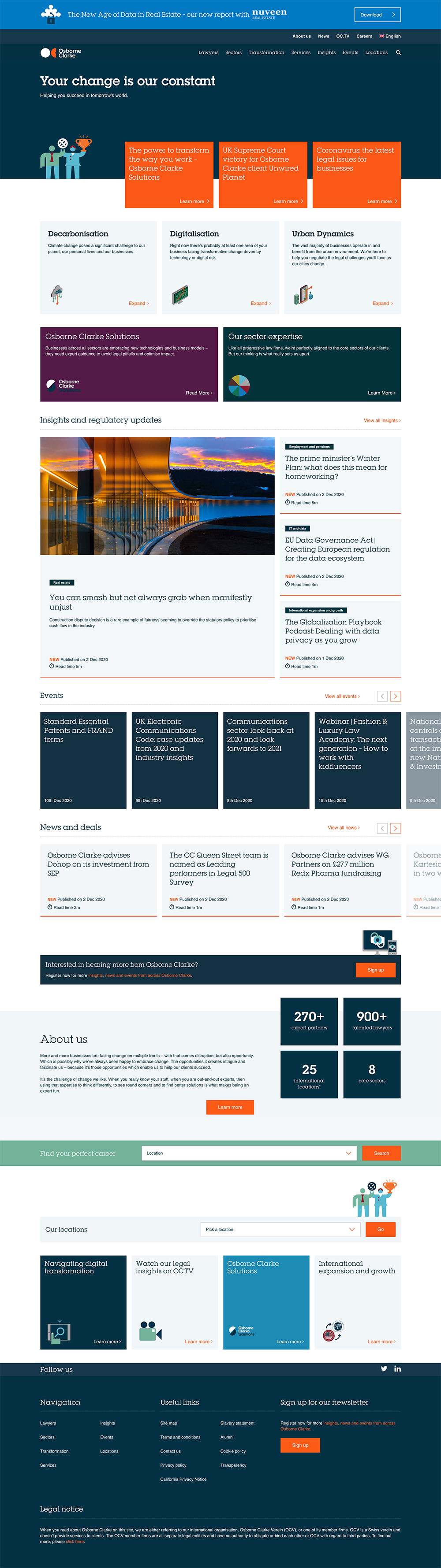
Why we liked Osborne Clarke
“Wow. This site is impressive. It’s one of the rare large firm picks on our list, and quite frankly there is a ton of well organized SEO friendly content on this site. I would imagine they have a very strong content marketing team, maybe even in-house. It does feel a little more like a resource library and leaves me kind of looking for a personality to connect with but it’s impressive nonetheless.” – John
“A hub of active content sometimes can become messy, unguided and too wordy. With a website like Osborne Clark I think they did a wonderful job with enticing a user to browse their content and still feel like they have a break. I love the bold colour blocking mixed with graphic illustrations – I also really like their logo. I think bold elements like this are so refreshing and bring (what could be) serious information to life.” – Taylor
“Unlike any other site on our list of the best lawyer websites for 2021, Osborne Clarke’s leans heavily into content marketing to build search engine visibility and credibility among their audience and potential clients. On this type of site, it isn’t even the design that matters all that much. But even so, they have done a good job of putting together a layout that is very news-like and grid-based, but it’s still varied and engaging enough to make me feel that those in their target market would be encouraged to dive deeper into their content. This site makes me feel like I would be dealing with people who know what they are talking about. That’s the power of content.” – Scott
“Another large firm that relaxed the look-and-feel of their website so as to not be overly conservative and traditional. The resources available to clients add tremendous value and there are lots of ways solo attorneys can do the same regardless of their practice areas.” – Kyle
Honourable Mentions for our Best Lawyer Website Designs of 2021
Get started in 10 minutes.
It’s easier and cheaper than you think to get started with a modern new website. It will help add instant credibility to your business and start attracting new customers to your business today.
Let an expert guide you.
Beam Local helps professionals launch better websites, outrank their competition on Google, and attract better customers for their businesses.
Or Call +1 (855)-831-4530 and Ask for Kyle