Best Lawyer Website Designs for 2020
NEW / The Best Lawyer Website Designs of 2021
This year we ended up surfing over 1500 lawyer websites to create the most complete list of the best lawyer website designs. Our team handpicked these winners and personally reviewed them. The list includes the best law firm websites, and while we are generally design driven this year we’ve also used Google to benchmark the sites for both desktop and mobile performance. We want to see equal parts beauty and performance when it comes to the design and development of the best lawyer websites.
This is our fifth year creating this list, and you can check out our original post of the best lawyer websites from 2016. Please take a moment to review our lists of the top legal websites for 2020 or take a look back at our best lawyer websites collections from Best Lawyer Websites of 2017 or the memorable list of 2018 List of Best Lawyer Website Designs and one of our most popular roundups which included video reviews of the best lawyer websites from 2019.
Kyle Godon is a legal marketing expert.
He’s personally helped over 128 lawyers. He’ll help you attract ideal clients for your practice.

90.6% Overall Website Rating
Mobile: 69% / Desktop: 95% / Design: 96% / Usability: 93% / Content: 100%
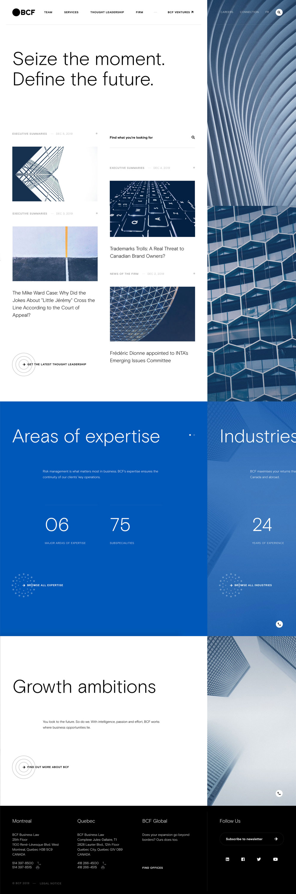
Why we liked BCF Business Law
“I wish we had data for the budgets on these sites. This is like when the Yankees or the Lakers beat up on smaller market teams. This is an awesome site but it’s clear to me that they had a design and content budget to support such a grand vision. I’m surprised the mobile score is so low though, maybe they needed an even bigger budget.” – John
“This one is just so good. 10’s across the board. You can tell each page layout and section has been strategically designed for the ultimate user experience and to drive clients. This modern approach to branding and web is quite unique for that of a law firm and it is great to see.” – Taylor
“BCF’s website effortlessly expresses a sense of professionalism and trustworthiness. The design is unique, but usable and reflects visually their efforts to provide “thought leadership” in their space.” – Scott
“I believe a lot of larger law firms feel they want to avoid breaking the mold by sticking to traditional, ‘safe’ website designs, but this larger firm’s unique website makes me see them as more modern and creative than their competitors.” – Kyle
87.4% Overall Website Rating
Mobile: 93% / Desktop: 98% / Design: 96% / Usability: 80% / Content: 70%
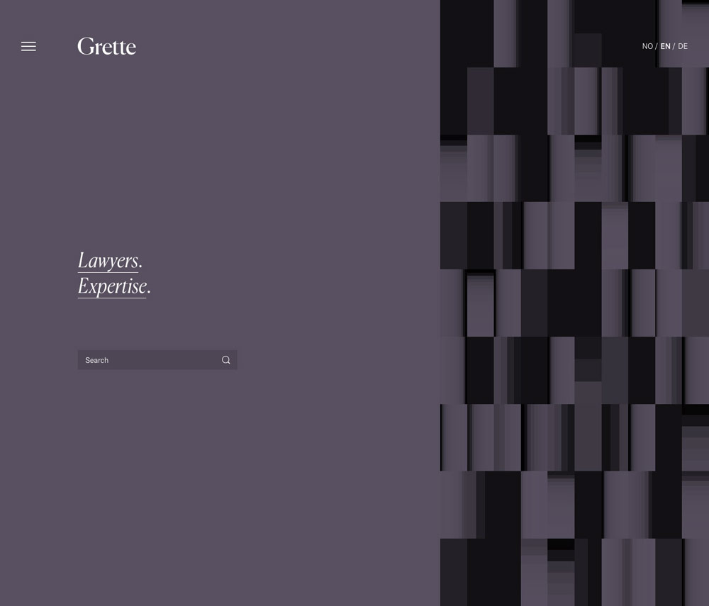
Why we liked Grette
“I love snohetta. This is what happens when a true design focused team is given creative license to brand a legal firm. It’s unique, memorable, and strikes that perfect balance between classic and forward thinking.” – John
“The design and ease of the content goes such a long way. Grette’s website provides a simplistic, branded experience throughout. Subtle design accents allow it to be unique and modern, while still portraying a corporate business feeling.” – Taylor
“There’s always something to be said for simplicity, and you can’t get much simpler than Grette’s homepage which points you in one of two directions: “Lawyers” / “Expertise”. In the end, people searching for a lawyer want to know two key things first and foremost: who you are and what you do. Grette’s website represents this desire perfectly.” – Scott
“Whenever I visit a law firm website, I’m either looking for a lawyer in particular or looking up their practice areas. I like the alternative ‘one-or-the-other solution’ right on their homepage which made me feel like I could find what I wanted really easily.” – Kyle
86% Overall Website Rating
Mobile: 76% / Desktop: 95% / Design: 80% / Usability: 96% / Content: 83%
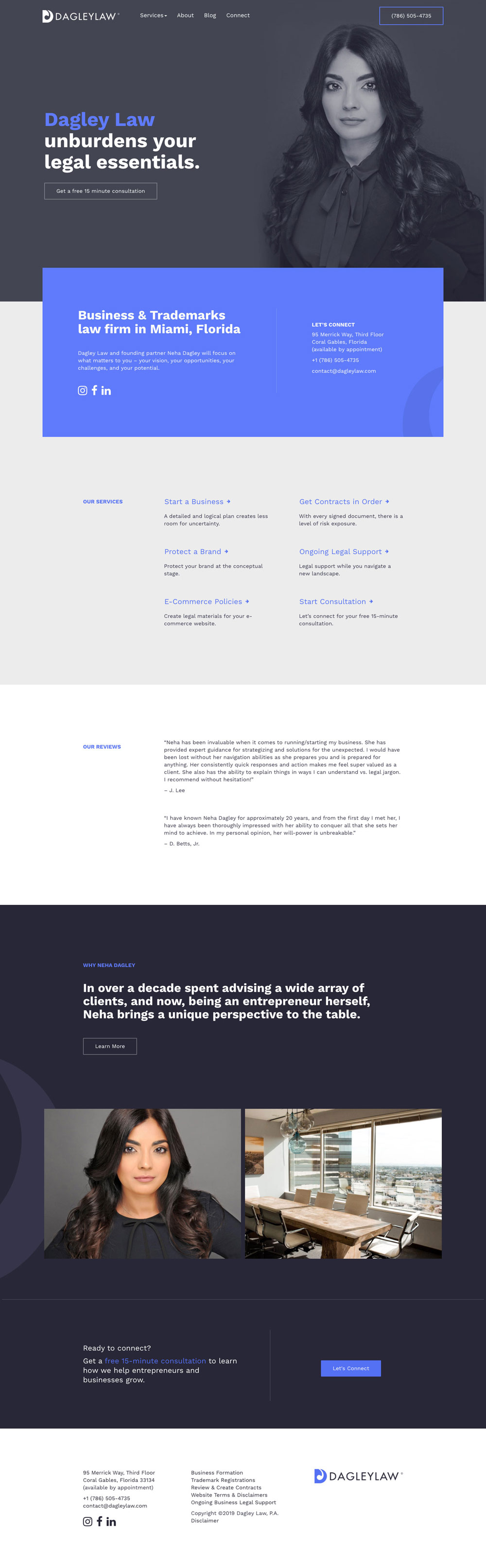
Why we liked Dagley Law
“I love this lawyer website. They pushed the design envelope just enough with colours and photography treatments but never lost site of the content or the intent of the user. It’s cool and memorable and easy to surf.” – John
“This is a great example of how a lawyer’s website can still function and meet all hierarchy standards, while still presenting their unique brand identity.” – Taylor
“Probably the best lawyer website for a sole practitioner that I’ve seen this year. When analyzed more closely, the structure of this website is quite strategic in how it presents the lawyer, their services, social proof, and encourages them to take action. Most lawyer websites could learn a lot from this site for Dagley Law.” – Scott
“This site feels incredibly personal which I think is a sole practitioner’s biggest selling point. As a potential client, I feel like I’d be working with a human and not a big law firm where my file will get lost in the shuffle.” – Kyle
4. Swiecki Kancelaria Adwokacka
“Crisp design with snappy interactions”
swiecki.com.pl
Designed by: Osom Studio
80.6% Overall Website Rating
Mobile: 98% / Desktop: 99% / Design: 53% / Usability: 83% / Content: 70%
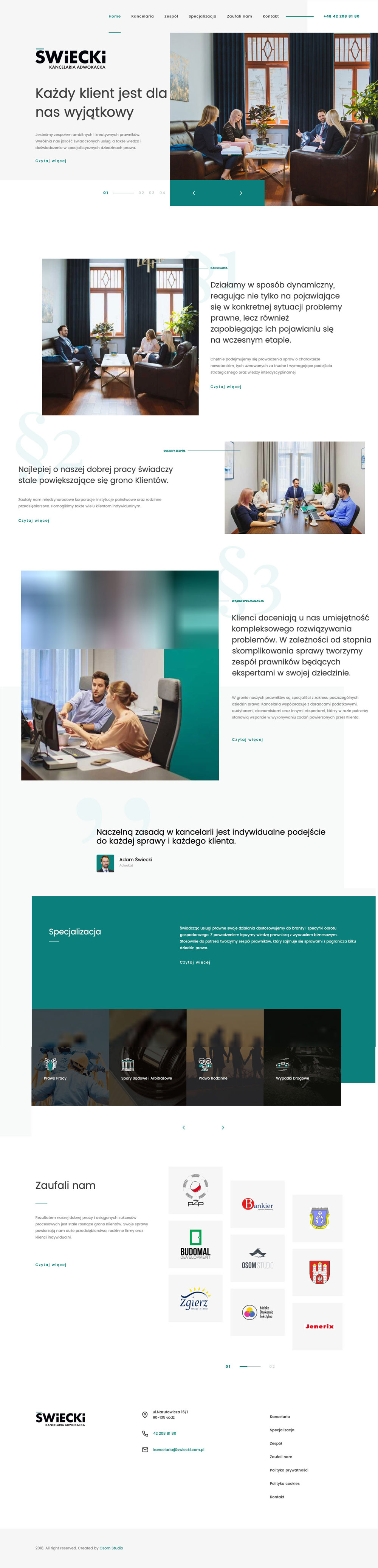
Why we liked Swiecki Kancelaria Adwokacka
“This site felt fast as soon as I loaded it. The tech scores were some of the best overall too. That’s impressive. Overall the design feels a little edgy, but almost in the way that some wordpress themes feel edgy. I don’t think that’s a bad thing, it’s just not my personal taste.” – John
“While this certainly is not my favourite legal website based on design alone, it is a great example of how a branded elements can help shape your website and online presence.” – Taylor
“Although perhaps a bit too busy in some areas and the use of justified text is questionable, the overall style of this website is nice and they’ve got some interesting design accents and layouts throughout that are worth taking the time to explore and be inspired by.” – Scott
“I like this site a lot. One of the new trends I like is ditching the same old large masthead photo & tagline combo on the home page, and instead having a tagline or logo to the left with a smaller image(s) on the right.” – Kyle
79.8% Overall Website Rating
Mobile: 48% / Desktop: 86% / Design: 93% / Usability: 86% / Content: 86%
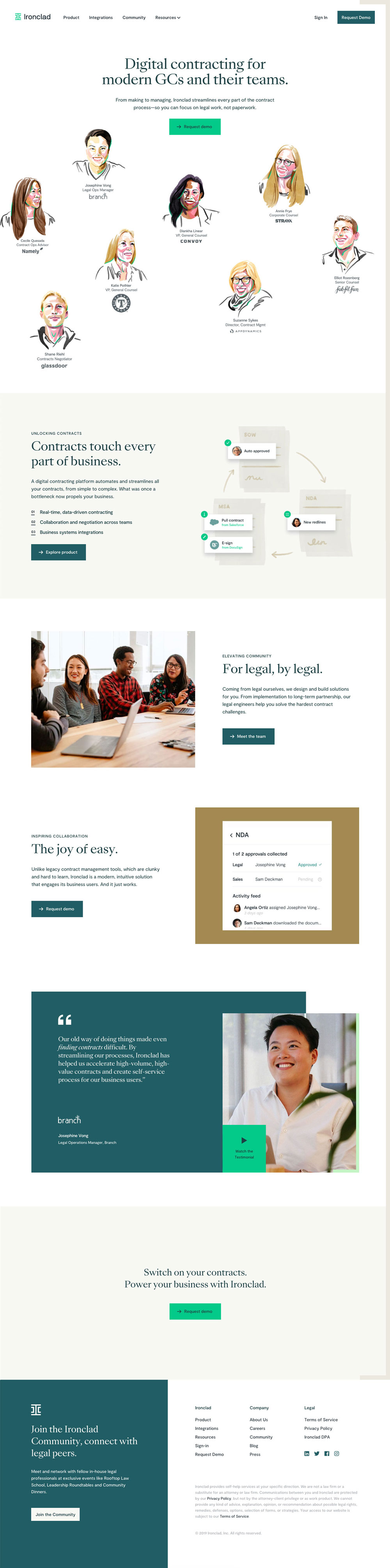
Why we liked Ironclad
“This site seems to wrap up every design trend into one cool package. They use a fresh colour palette, custom (good quality) sketch like graphics, and an emphasis on storytelling. Overall the design is memorable and it just feels like an app made by humans for humans. They also seem to understand the value of content marketing and while their resource library is a little thin, it appears to be of good quality. Someone there obviously gets it. Good stuff.” – John
“While not a lawyer website, it still focuses around the same driven content. This site is bold, dynamic in all the right places while being easy to browse. The simplistic touches of illustration and punch of colour really allow this site to have a stand-out design.” – Taylor
“In a world littered with websites using uninspired illustration styles, the new branding and illustration style of Ironclad stands out and makes a huge statement for this company. Their new branding combined with great site design and a sizeable blog and resource library contribute to making me feel that they are the absolute authority in their space. All lawyer websites should strive to do this as well; express your personality and share your knowledge to build trust and authority in your market.” – Scott
“Someone once asked me if professional caricatures on a legal website were a bad idea, but I don’t think so! I always find them interesting to look at and I think it makes the user experience a little more memorable without doing anything too radical that might push the envelope.” – Kyle
78.2% Overall Website Rating
Mobile: 78% / Desktop: 80% / Design: 80% / Usability: 80% / Content: 73%
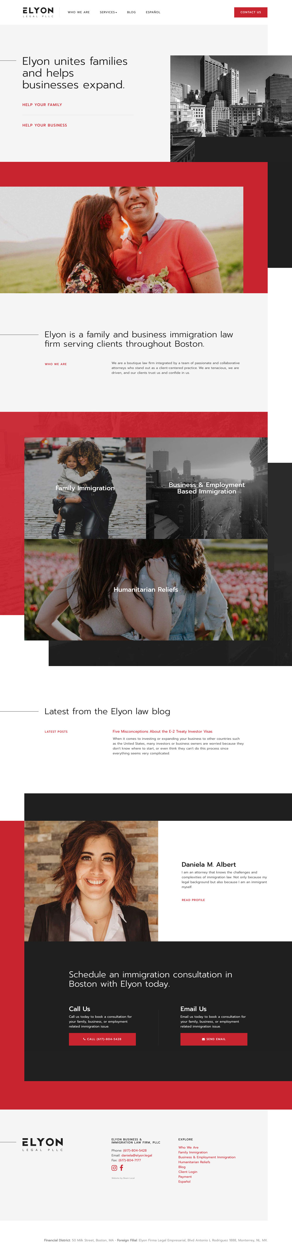
Why we liked Elyon Legal
“The red and charcoal colour scheme is really vibrant, and the animations used throughout give this lawyer website design a modern and vibrant feel. It’s like drinking a red bull, this website gives me wings.” – John
“I think this is one of the best lawyer websites I’ve seen this year. A modern approach to a business driven practice. Through its use of bold colours, layout and design accents it allows it to stand apart from the rest while still engaging you to see firm’s identity through the design.” – Taylor
“The layering and animation utilized on this website is impressive, but what I like the most is how clear the header is. First impressions are important. It presents to very clear options: “Help Your Family” and “Help Your Business”. Law firms should strive for this level of clarity in their copywriting.” – Scott
“Hands-down the best immigration law firm website I’ve ever seen. Ditching stressful images of passports, national flags, and courtrooms and replacing them with warmer photos of real people…I think this resonates better with individuals who are yearning to make this country their new home.” – Kyle
76.8% Overall Website Rating
Mobile: 77% / Desktop: 81% / Design: 73% / Usability: 80% / Content: 73%
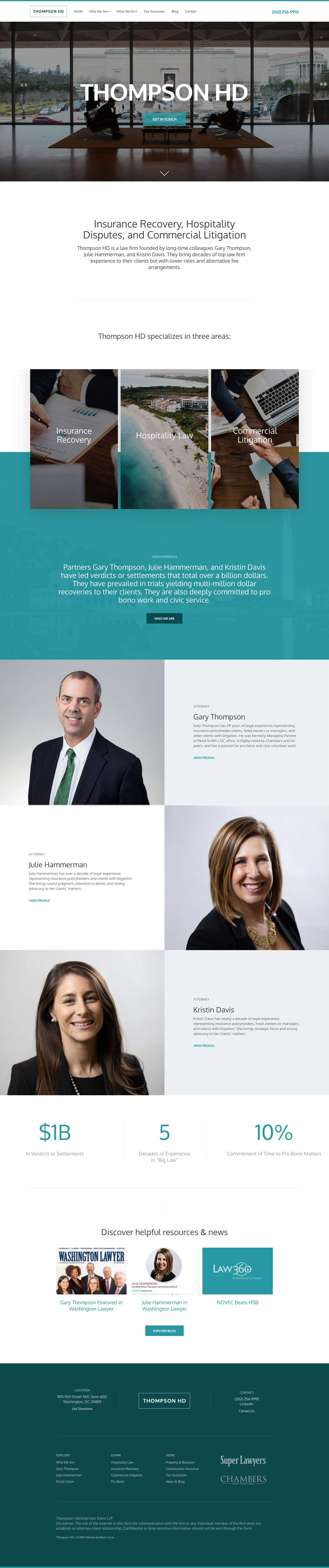
Why we liked Thompson HD
“Designing a good lawyer website on a budget is a challenge, smaller firms are often limited in terms of the photography and access to content. This site does an amazing job of helping this team stand out from the crowd without breaking the budget.” – John
“We designed this firm’s logo, identity and website and I think all work together really great. This website allows the firm to be approachable, modern, and trustworthy through the layout, content and use of headshots and personality.” – Taylor
“Thompson HD’s website is one of the best lawyer websites of the year because it does what it is supposed to do; make me feel like I can trust this firm. It utilizes animation to draw attention and draw you inwards, rather than in a way which seems to be done for the sake of doing it. The practice ares and team members are all presented clearly. I like it.” – Scott
“I’ve shown this website to a few specialized litigators and they tend to love it. They often agree that this site serves a diverse audience, striking a balance between being the people’s lawyer to the general public and as seasoned litigators to opposing counsel who might be sizing them up.” – Kyle
76.6% Overall Website Rating
Mobile: 76% / Desktop: 88% / Design: 86% / Usability: 83% / Content: 50%
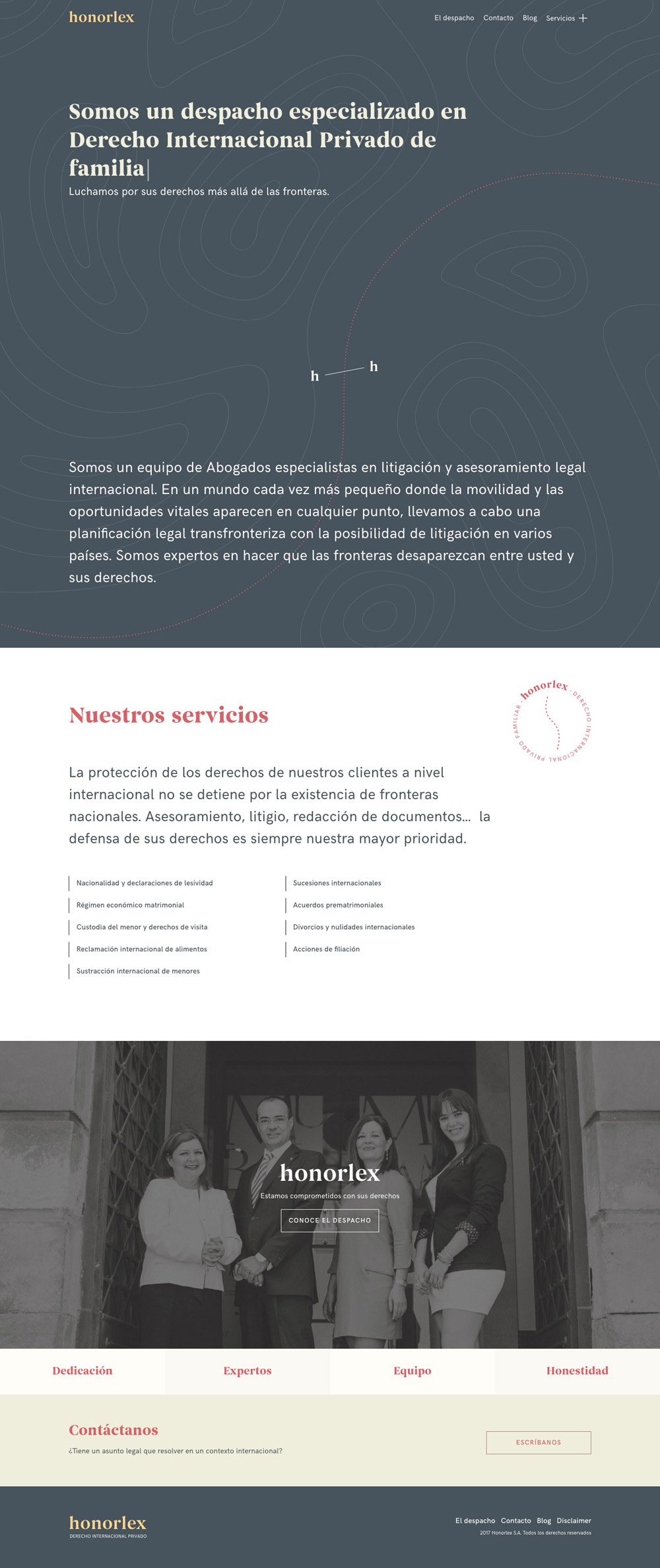
Why we liked Honorlex
“I’m really happy to see this site make the list. It’s clear that a very talented brand designer directed things. It’s unique in many ways. I don’t think the live website has anything super unique in terms of interactivity but maybe that’s ok. I’d like to see more sites like this one with a unique point of view.” – John
“While contained, I still really like this website. It’s clean, straight to the point and still has some advanced design touches throughout. I like their bold but muted colours, simple structure and overall flow of the content. I would say a downside is the way their bios link to individual pdfs.” – Taylor
“Strong typography, modern colour scheme, slick animations; this law firm website has effectively put together all of the elements needed to make it one of the best lawyer websites I’ve seen this year. The only area which might need some improvement is their content; they’ve simplified it well for their service pages, but a more comprehensive blog would be beneficial for them.” – Scott
“A great-looking site. My suggestion to this firm would be to build and optimize a few pages in English and Italian since they provide legal services in these languages, too. We’ve helped a few clients rank well on Google for terms such as Polish-speaking lawyer or abogados in their areas.” – Kyle
9. van Cutsem Wittamer Marnef & Partners
“Sophisticated and forward thinking design”
vancutsem.be
Designed by: Atelier Design
73.4% Overall Website Rating
Mobile: 54% / Desktop: 91% / Design: 73% / Usability: 73% / Content: 76%
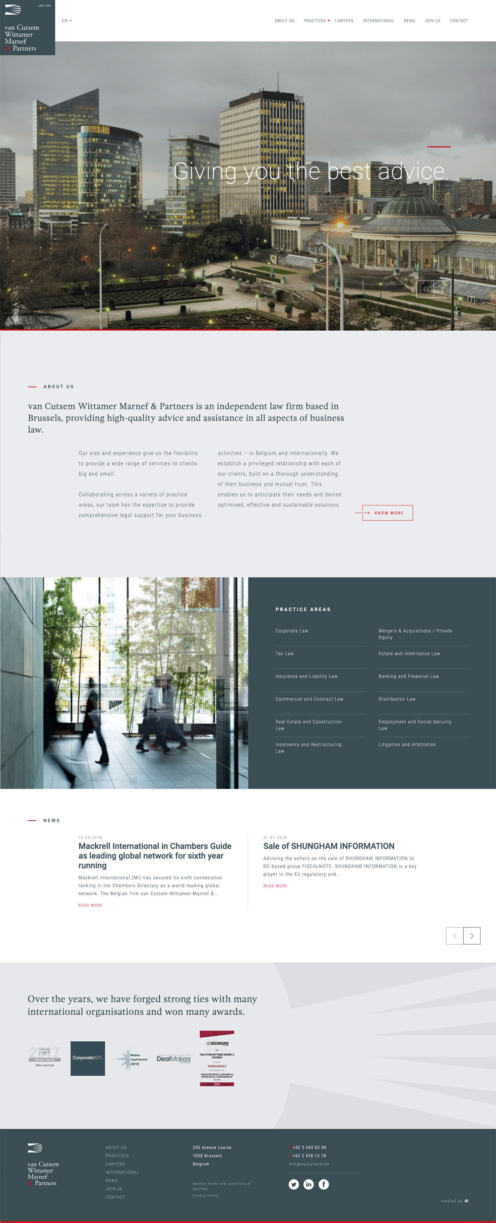
Why we liked van Cutsem Wittamer Marnef & Partners
“This is a tough one. I feel like it should be disqualified simply because it’s not a secure HTTPS lawyer website. Looking beyond that I can’t help but think this site was designed by someone with a little more print experience, using the site it feels heavy and slow to me. I love the header section designs but in the end the text is hard to read and the page layouts are overly complicated.” – John
“This website allows great design for a large corporate firm to stand out. Unique grid, dynamic split galleries and just the right amount of animation help liven up more of the business-looking content.” – Taylor
“This website is detailed and well-structured with unique gridded layouts throughout. In my mind, it feels exactly what an international law firm website in 2020 should feel like.” – Scott
“Even though Google Chrome offers some pretty easy webpage translation features nowadays, I think most people may not be familiar with them yet. So I think it’s good to see language options so easily accessible for this international firm.” – Kyle
71.4% Overall Website Rating
Mobile: 46% / Desktop: 75% / Design: 70% / Usability: 76% / Content: 90%
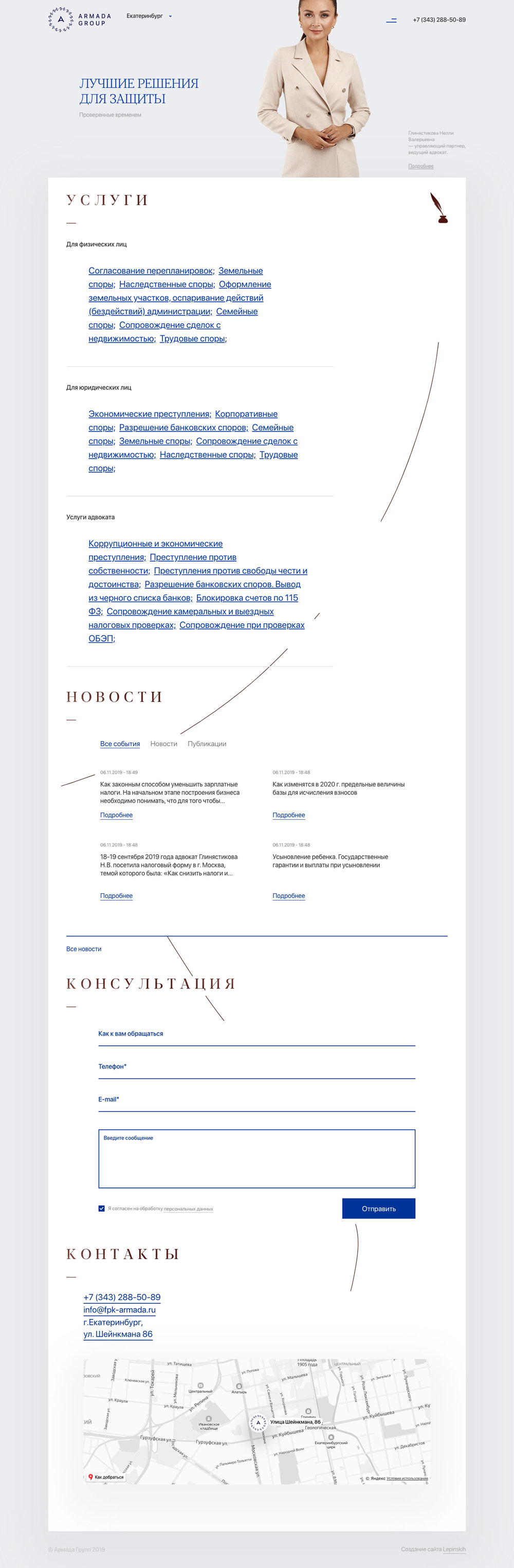
Why we liked Armada Group
“At a glance it feels like an exercise in SEO. There’s a lot of text and links, everywhere. It feels like a really modern and cool craigslist – I wonder if it was a rebuild where they had to keep existing page structures – but then that little thin line animates as you scroll and that’s enough for me to think there’s more than meets the eye. This one I’ll remember.” – John
“This website is a bit too content driven, where it is beginning to be too wordy and not very approachable. With that said, I think the colours, quill path graphic and use of white space still keep it from being too overbearing. I like the unique approach to the quill leading you through the content.” – Taylor
“The contained approach taken on this lawyer website is what stands out to me. The white box present on all of the pages helps to create a sense of focus visually that might be lost on some other sites which try to fill all the available space.” – Scott
“I like the interesting animation that follows me as I scroll down. Some of our clients have told me that a good quality website equates to good quality legal services in their clients’ eyes. I agree. And I think subtle enhancements like this set that expectation.” – Kyle
11. The Law Practice
“Chic design and progressive interaction”
thelawpractice.org
Designed by: Form Digital
71% Overall Website Rating
Mobile: 59% / Desktop: 83% / Design: 80% / Usability: 73% / Content: 60%
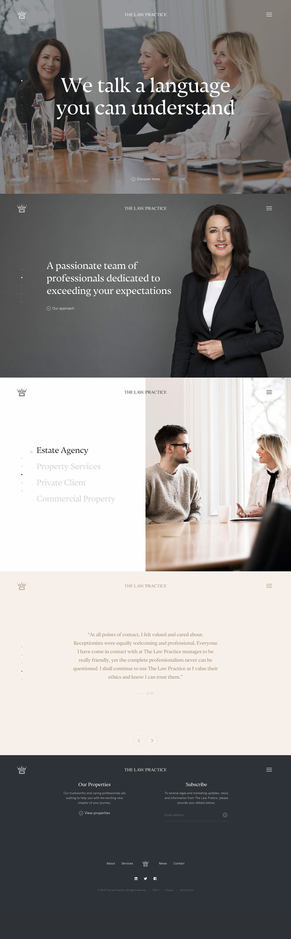
Why we liked The Law Practice
“Oh hello there, I wasn’t expecting that full panel scroll and the more I surfed this site the more I liked. I love the custom photography used throughout and the intro copy really hits the nail on the head. ‘We talk a language you can understand’. That’s what potential clients want to hear. I think they get bonus points since they all wore really sharp looking black and white clothing on their team page.” – John
“This site is the perfect combination of sophistication while still being personable at the same time. The design holds a lot of small elements that reflect care and thought went into it. This is where I think every firm should set the bar for their own website.” – Taylor
“The panelled approach of The Law Practice’s website homepage makes it extremely easy to follow and the typography is excellent. Their photography throughout is also quite good as well and helps me to feel connected with the team even before contacting them.” – Scott
“I really like the team photos on the “About” page as I think it’s important to make time for a professional photoshoot. I also think it’s important to plan ahead… if new lawyers or support staff join you in the future, make sure it’s easy to follow the same theme!” – Kyle
68.4% Overall Website Rating
Mobile: 42% / Desktop: 85% / Design: 76% / Usability: 63% / Content: 76%
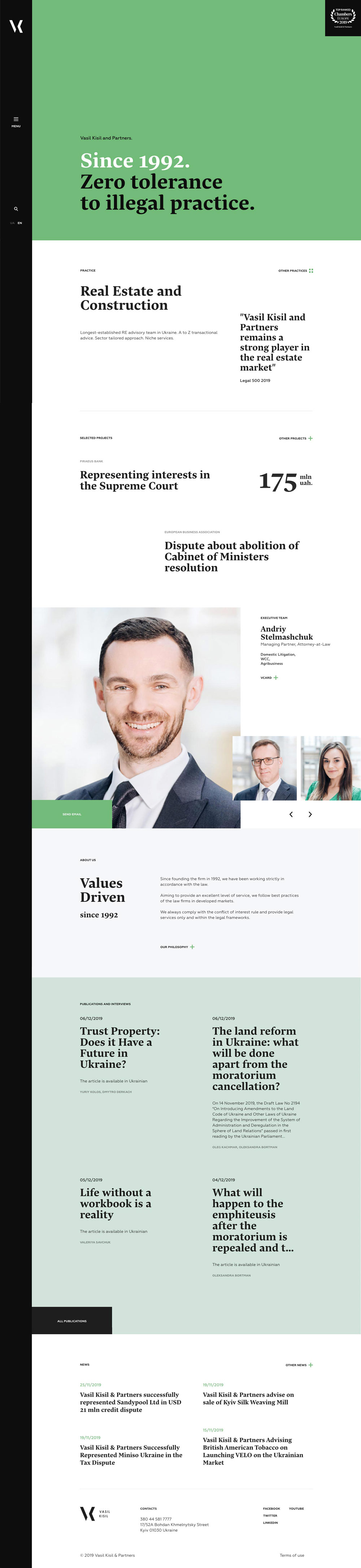
Why we liked Vasil Kisil and Partners
“It’s a highly original website design for intellectual property lawyers so I guess that makes a lot of sense. Maybe a little too modern for my particular tastes but it certainly stands out as being cool and trendy. I also appreciate the efforts they took to create unified photography, and to publish detailed case studies which no doubt helps with their SEO efforts.” – John
“A fun approach to a legal website certainly allows it to stand up against the rest. This website is a great example that you don’t need stock photography on every site to still be appealing to a user. The colours, structured elements, menu and dynamic animation allow this text based site to still not be overbearing and easy to browse.” – Taylor
“The logo, menu, search, and language functionality locked along the left side of the page is a unique choice. Most websites scroll from top to bottom, so allowing for more content vertically by putting the aforementioned elements along the left instead of the top is actually a smart choice for that reason. Although, because it is uncommon, it may be confusing for some users.” – Scott
“It’s good to see that their Publications section is up-to-date with articles dated as little as a week ago since writing this. Blogging or updating a News section creates a ton of value for your website, but it looks bad to clients if the last article was from two years ago.” – Kyle
65.8% Overall Website Rating
Mobile: 57% / Desktop: 74% / Design: 66% / Usability: 66% / Content: 66%
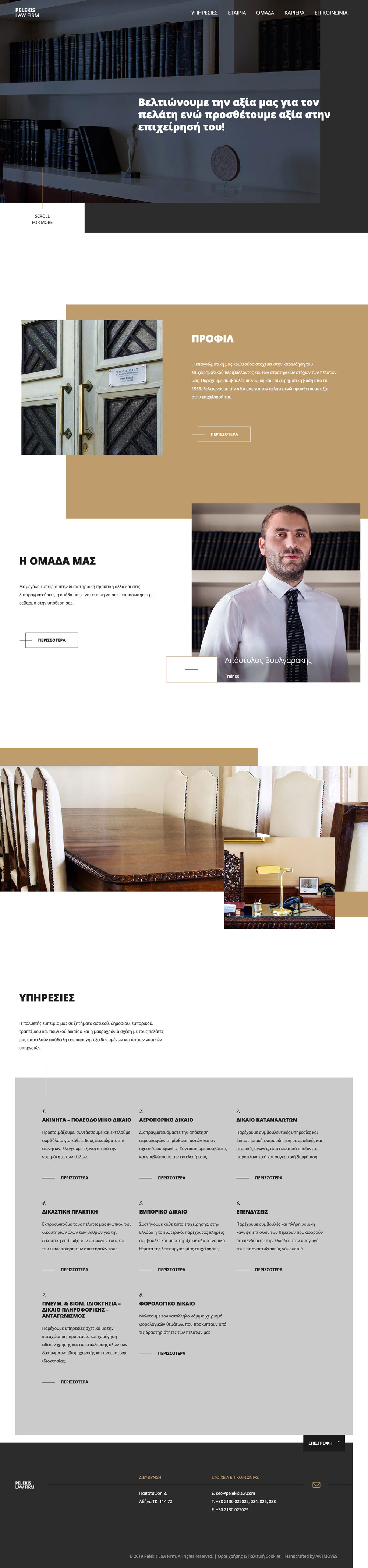
Why we liked Pelekis Law Firm
“It feels authoritative to me. The colour scheme reinforces trust and experience. So the basic design I like, I just think it’s a little too animated. It’s like they added one too many elements of movement. In this case I think that’s distracting and makes it feel cheaper than it should.” – John
“This website allows all of the main objectives of the firm to stand out in a clean and minimal way. I like the rotating headshots, I think this is a great use of showcasing many attorneys, while not using a ton of space. The simplistic structure of the interior pages also is a great way to ensure the ease of content and to utilize a layout for different uses.” – Taylor
“This website continues a trend of photography overlapping with solid coloured blocks that seems to have emerged in several of the best lawyer websites for 2020. It’s a bold look that makes an impression and Pelekis Law Firm does it well. Maybe tone down the animation, though.” – Scott
“We’ve seen the classic law firm photo of 15 lawyers standing side-by-side over and over again. I think the rotating headshots of each lawyer on this site is a better alternative because it makes everyone feel included, without polluting the home page with a busy group photo.” – Kyle
14. Van Rijckevorsel Mencke
“Well balanced and approachable”
vanrijckevorselmencke.com
Designed by: Heavyweight
62.4% Overall Website Rating
Mobile: 91% / Desktop: 96% / Design: 53% / Usability: 86% / Content: 66%
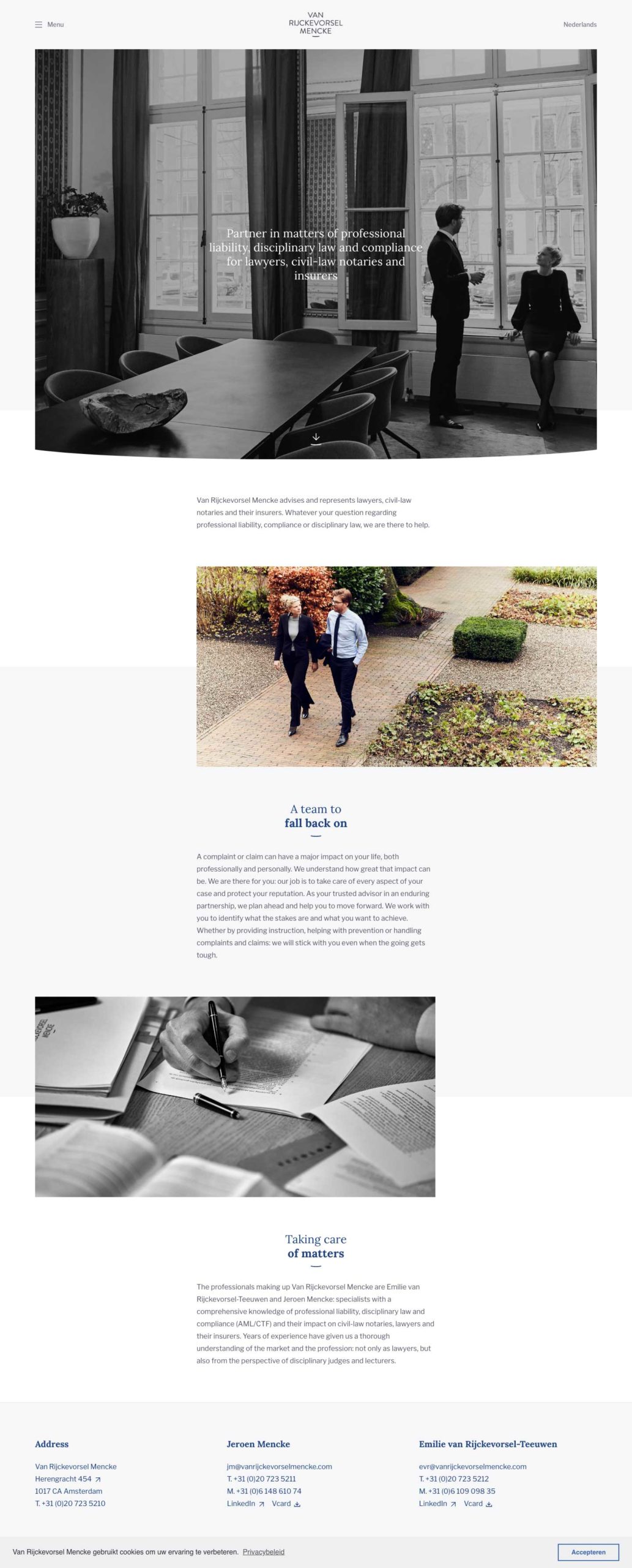
Why we liked Van Rijckevorsel Mencke
“Sometimes a simple and approachable design is the best way for a law firm to attract a client. I like the oversized fonts, and the cool greys and blues. Their logo has a nice twist which is reminiscent of a smile” – John
“Van Rijckevorsel Mencke has just the right amount of detail within its design to become not just another law firm website. While sticking to more of a minimalist approach, the site is user-friendly, clean and to the point.” – Taylor
“Van Rijckevorsel Mencke’s website is the definition of simple, yet dynamic. It feels modern and clean without trying to inject any unnecessarily complex layouts or animations. It would be helpful if they had more in depth content available, but what they do have is wonderfully presented and easy to browse.” – Scott
“I like the level of modesty that is achieved all while still coming across as being good at what they do. Seeing actual photos of the lawyers Jeroen and Emilie on the home page make the firm feel more inviting to me and removes the layer of guesswork that comes with not knowing who I’m working with.” – Kyle
Honourable Mentions for our Best Lawyer Website Designs of 2020
Top Lawyer Website Design Trends for 2020
- For years websites tended to feel modern, boxy and abstract for 2020 we’re seeing a shift towards a more natural, humanize approach to design. We see more law firms uses honest photography (no stock), playful and original illustrations and caricatures and some more muted and earthy colour tones.
- SEO for lawyer websites continues to be a top trend in website design. We’re seeing more sites with better H value structures and a much wider range of content marketing being used as lawyers unlock their content and start publishing it as resources on their websites.
- The shift towards mobile continues, and website speed is more important than ever. We scored each site for both desktop and mobile so you can see which law firm website design is the fastest and technically the best.
Let an expert guide you.
Beam Local helps professionals launch better websites, outrank their competition on Google, and attract better customers for their businesses.
Or Call +1 (855)-831-4530 and Ask for Kyle