Best Lawyer Website Designs for 2019
NEW / The Best Lawyer Website Designs of 2021
Every year we review thousands of lawyer websites to create the most complete and definitive list of the best lawyer website designs. For 2019 we surfed over 3,000 legal websites and our team handpicked these winners. This collection of amazing legal related website designs has set a completely new benchmark for design, performance and features. When we posted our original list of the best lawyer websites from 2016 we would never have guessed that sites would evolve so quickly. Please take a moment to review our lists of websites below or take a look at our best lawyer websites collections from 2017, 2018, and 2020.
Click here to find out how you can attract better clients for your legal practice.
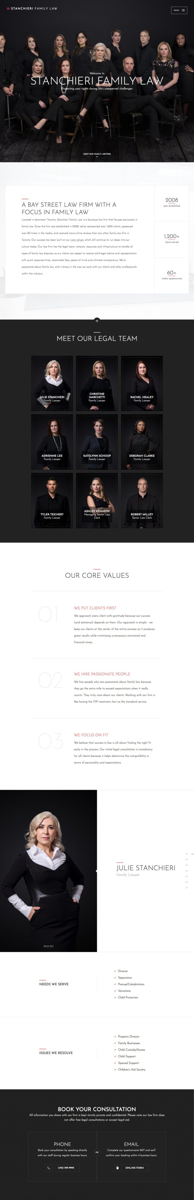
Stanchieri Family Law
Refined design, smart strategy.
The simplicity of this homepage for Stanchieri Family Law is deceptive. It is a perfect illustration of the old mantra “less is more”. On a potential client’s journey from research to decision-making when it comes to choosing a lawyer, one of the most important factors is for them to understand and trust who they are working with. Stanchieri Family Law’s website puts this front and centre with their profiles–complete with stunning photography–as the primary elements on the homepage.
Beyond that, touches such as finishing each page with a call to action and forgoing a proper “footer”, their multi-step consultation form, generous line-spacing, simple legal fees calculator, and case studies help to make this one of the best lawyer websites for 2019. They claim to have the more reviews on Google and Lawyers.com than any other law firm in Toronto and it’s easy to see why.
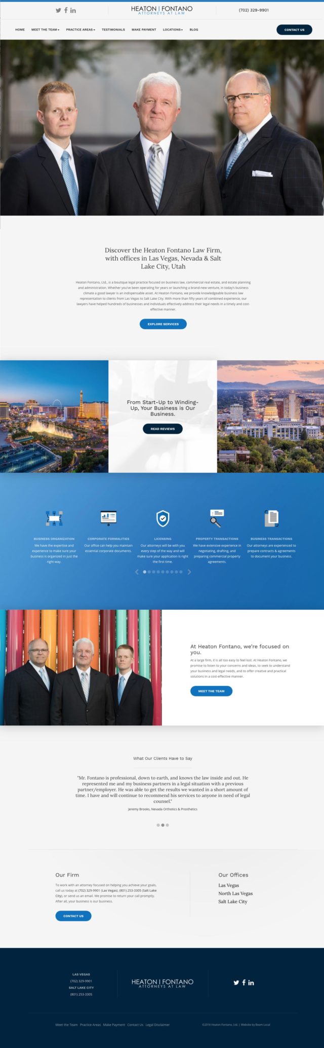
Heaton Fontano
The prototypical modern lawyer website.
When you think of lawyer websites, something like Heaton Fontano Law Firm’s website is what should come to mind as a prototypical example of what you need to do to produce a successful website. Their headshots are professional, strong, and authoritative which helps to build trust even before any content is read. Their colour scheme is refined and approachable. Their typography is solid. Their content structure is easy to follow and the amount of information is just right. You name it, they’ve done it better than most.
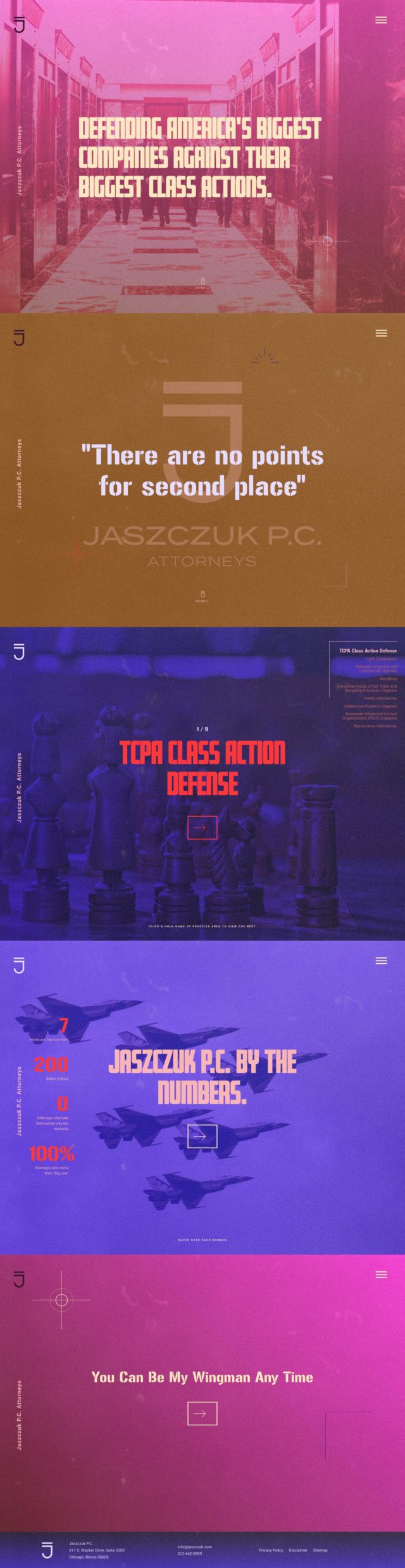
Jaszczuk P.C. Attorneys
Unique branding places this website in a league of its own.
If Heaton Fontano shown above is the prototypical lawyer website, Jaszczuk P.C. Attorneys website is the atypical lawyer website. People searching for lawyers often expect certain things from the attorneys they are evaluating. Meeting those expectations is important. But sometimes it’s easy to become lost in the crowd if you don’t do anything to set yourself apart.
Jaszczuk has purposefully taken a one-eighty and gone in their own unique direction. Their personality shines through the use of distinctive colours, unconventional typography, and thoughtful photography (the headshots on the headers of the individual attorney pages are some of the most unique and fun we’ve seen) while still presenting the critical information that potential clients are seeking. This is the best lawyer website for 2019 that you’ll find for a law firm with a truly unique brand and website to match it.
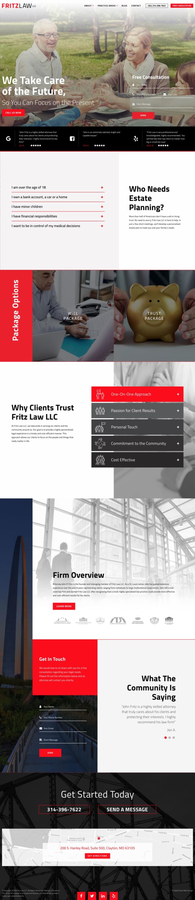
Fritz Law LLC
Effective above the fold content.
Fritz Law LLC distinguishes itself with a strong presentation of valuable content above the fold. Most users on any website will typically absorb the content and then the footer much more than whatever is presented in the middle. Therefore, the header on Fritz Law LLC is effective as presents a selection of reviews to build trust and a contact form to easily get in touch with them.
That’s not all there is to the website however. Further down on the page, their messaging is strengthened by qualifying who needs their services (“Who Needs Estate Planning?”) and then why clients trust them “Why Clients Trust Fritz Law LLC”. Through skillful use of expandable panels, they present all of this and more without the page feeling overwhelming in terms of content.
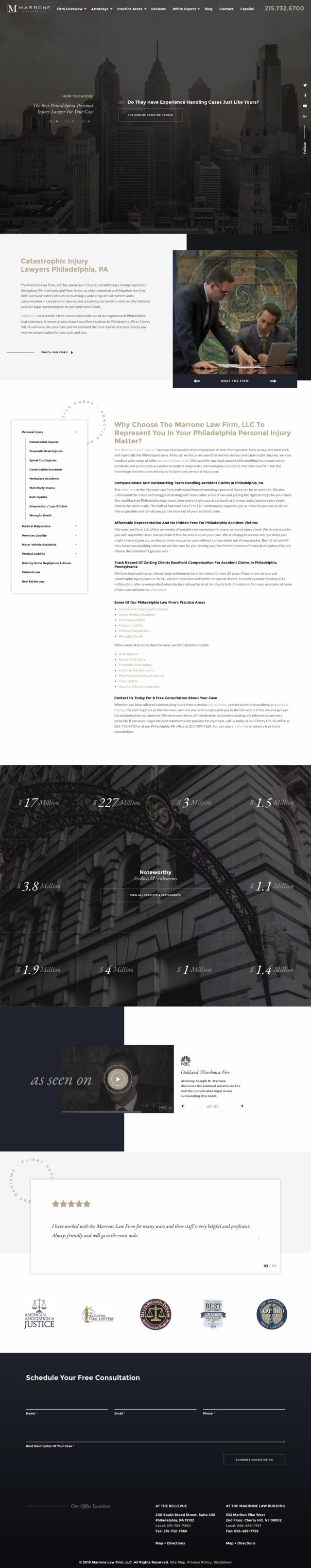
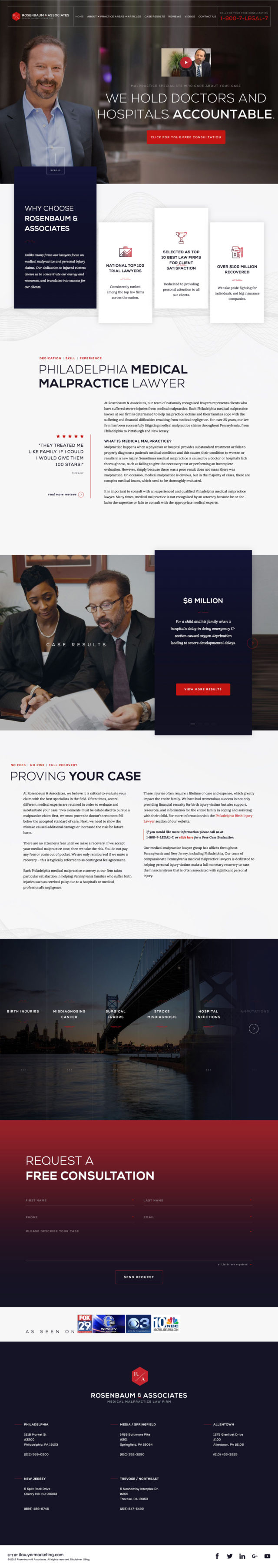
Marrone Law Firm LLC
Light colour scheme conveys a sense of calm and confidence.
Marrone Law Firm’s website does a great job of communicating why clients should choose them throughout their page. Instead of opening with a typical large headline, they let the header breath and designed it to be more minimalistic and based upon the question “How to Choose The Best Philadelphia Personal Injury Lawyer For Your Case”. We love where it goes from there with the auto-play video in the intro. Below that the circular rotating “PRACTICE AREAS” graphic grabs your attention. The case results tiles further down, and a rare “as seen on” video showcase section are also stand out elements. Closing out the page with reviews, badges/awards and a consultation form helps to make this a well-crafted page from both a design and strategic standpoint.
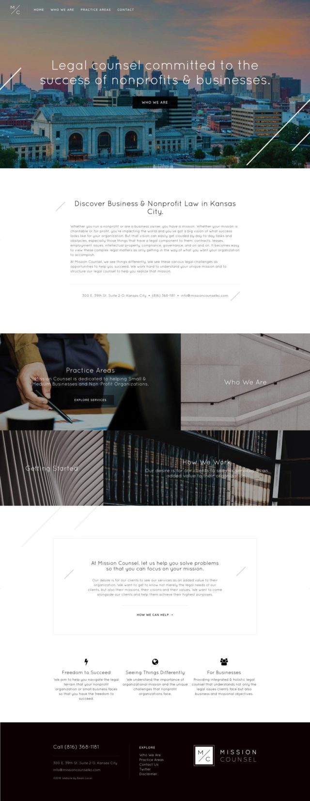
Mission Counsel KC
Minimalistic site with subtle parallax effects.
There’s several aspects of this website which stand out to us. The black and white colour scheme, the subtle and clever parallaxed angled lines throughout the page inspired by their logo, and the approachable Quicksand font. All three help to convey a strong sense of direction, mobility, and dynamism. The header makes it crystal clear what their focus is and the four tiles in the middle of the site make it easy for users to dive deeper into the site. It’s easy to trust a lawyer that presents their mission in such an easy-to-understand and visually refined way like this.
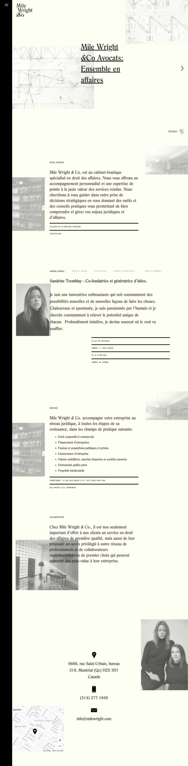
Mile Wright & Co
Distinctive horizontal scroll style.
This website stands out from the rest on our list because of its horizontal scrolling nature. The horizontal scrolling approach is not a common one in web design no matter what industry you’re in. It’s always a nice change of pace landing on a page that scrolls this way. Having your site scroll horizontally is an easy way to make your site a little bit more memorable than most. The subtle animations as you pass between each section helps to make the transition seamless and slick as well. Mile Wright & Co’s branding also scores high points from us. The minimal colour scheme, black and white photography, and strong large typography bring this one together for us.
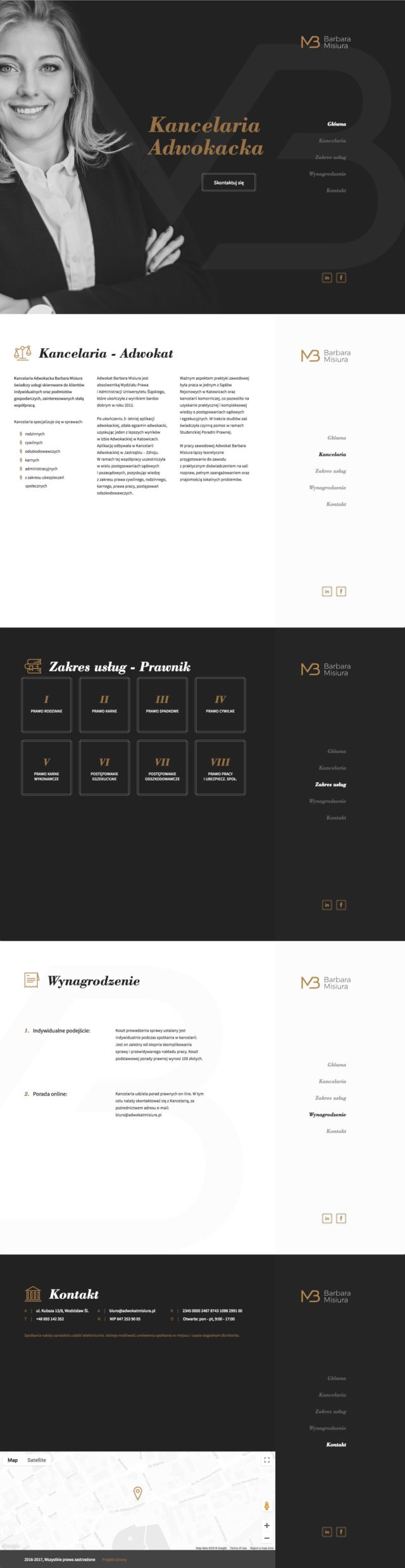
Barbara Misiura
Easy-to-follow paneled approach.
Scroll jacking: some people love it, some people hate it. What is it? It’s when a website takes over the speed of your scrolling to automatically bring you into the next section. Barbara Misiura’s website is one that does it right. The site is divided into five clear panels and is assisted by a locked navigation along the right hand side. We appreciate how easy this website is to navigate and understand. Many lawyer websites throw as much as they can on the homepage without thinking so much about their content structure. Forgetting to ground the user so they can understand where they are at in their journey is dangerous, but this site is one of the few we’ve found to make easy navigation a priority.
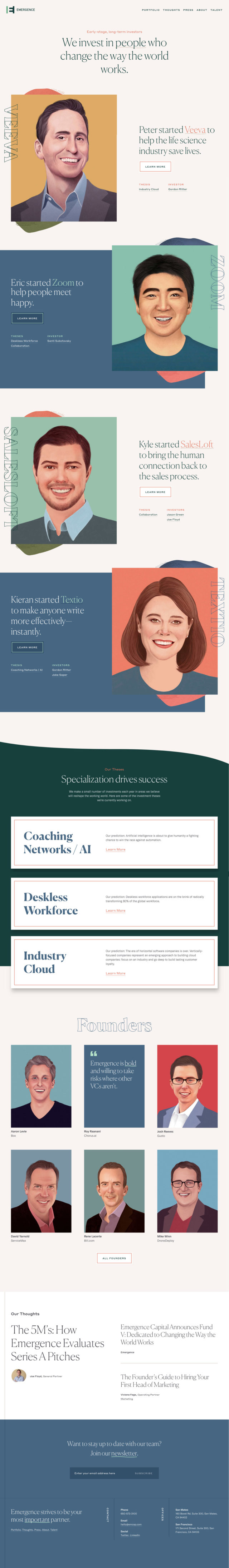
Emergence
Unique portrait styling and inviting colour scheme.
While this website isn’t actually for a law firm, we wanted to include this site to show you that the best web designers will look for inspiration from other industries. If it’s about building trust and having your website stand out in a crowd this site is a perfect example of how you could create the most unique legal website design for your practice.
SMCM Law
Simple and effective structure.
This website is a perfect illustration of how professional photography as well as a solid layout and typography can help legitimize a lawyer’s business. We particularly love the strength of the full screen header. The profile photo in the background is authoritative, the headline is unmissable, and the call to action is bright. Any sole practitioner should be looking at this as the benchmark for what their website should be.
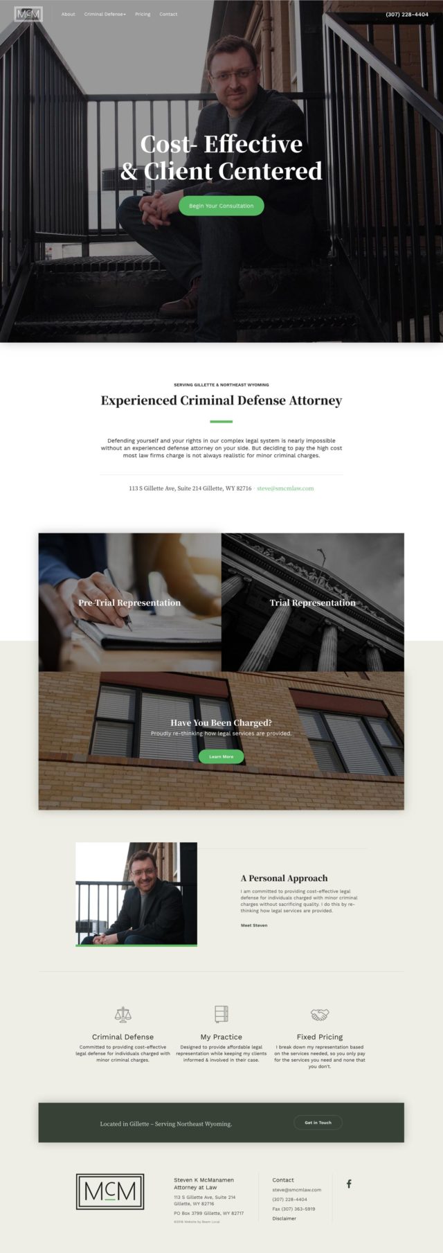
Watch our video walkthrough of smcmlaw.com
Honourable Mentions for our Best Lawyer Website Designs of 2019
We browsed over 3,000 lawyer, attorney, and law firm websites so we wanted to give out a few honorable mentions to some firms who stood out for having modern designs, interesting legal photography, or a forward thinking approach to their lawyer website content.
Click here to find out how you can attract better clients for your legal practice.
Let an expert guide you.
Beam Local helps professionals launch better websites, outrank their competition on Google, and attract better customers for their businesses.
Or Call +1 (855)-831-4530 and Ask for Kyle