Best Lawyer Logos & Branding of 2021
Having a professional website is a great way to establish your law firm’s voice while attracting new clients. However, that is only one piece of the puzzle. Having a professional logo and branding is the most important way to ensure that your firm’s identity is cohesive across all platforms, from the web, to business cards and printed materials. Your clients choose a legal professional, and so your branding should portray that.
Looking for some inspiration for your Law Firm’s new logo? Explore Beam Local’s popular posts on the best law firm websites, logos and branding.
If you’re interested in having a new logo designed for your legal practice please get in touch for a free consultation with our team at Beam Local today.
Need help with branding your legal practice?
Kyle Godon is our legal marketing expert. He’s personally helped over 128 lawyers and he will help you attract ideal clients for your practice.
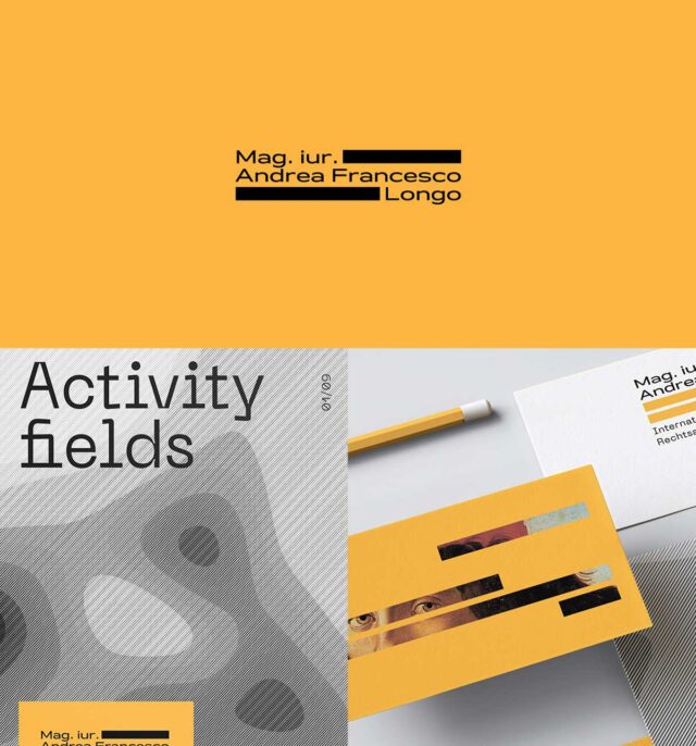
Abstract Encryption
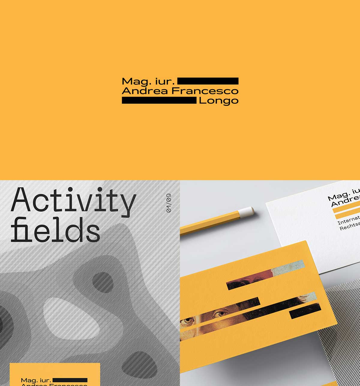
Andrea Francesco Longo Designed by Dream Brand Studio
Longo’s branding dives deep into the symbolism derived from legal documents with partially blacked out fingerprints and the reference of stroked out text in classified files. Both nods to this law firm’s business identity which then creates an incredible visual aesthetic and brand.
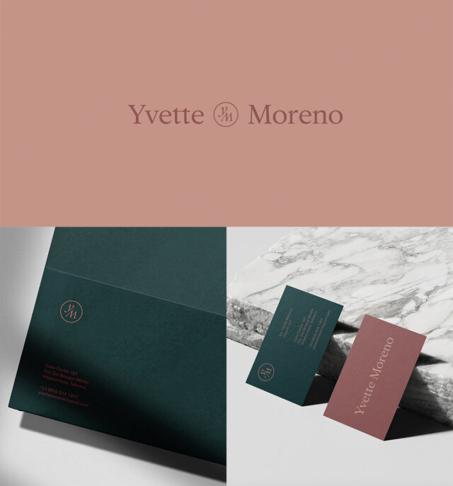
Sophisticated & Feminine
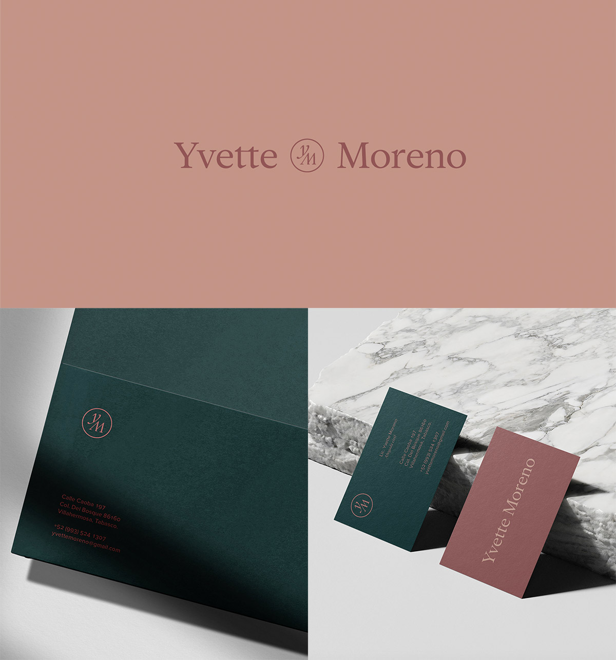
Yvette Moreno by Placebo Estudio
Yvette Moreno logo and brand design is the perfect example of a law firm which is both be powerful and feminine. The soft tones mixed with the bold pair perfectly with the serif modern typeface. This branding is one that you can resonate and connect with.
A Modern Approach
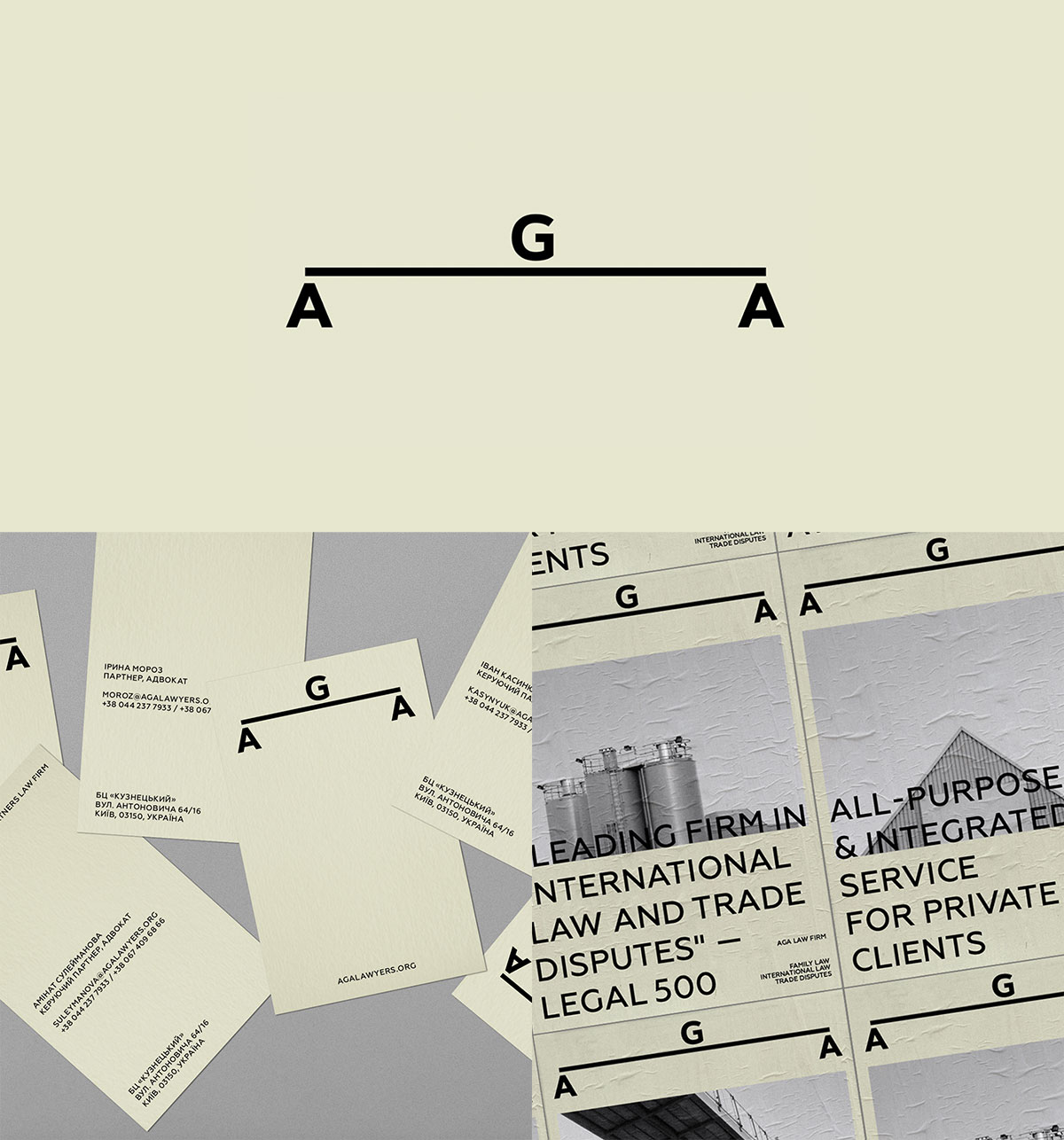
AGA Partners Designed by Vandog Agency
It is just so simple that it works. Playing off of the typical Scales of Justice symbol that most law firms go for when wanting to have a logo, AGA Partners’ takes a creative twist to that. The bold sans serif balanced with the thick stroked line pleases the eye and then captures you with the muted green and black and white photography. This is definitely branding which would attract younger clients for a more modern law firm.
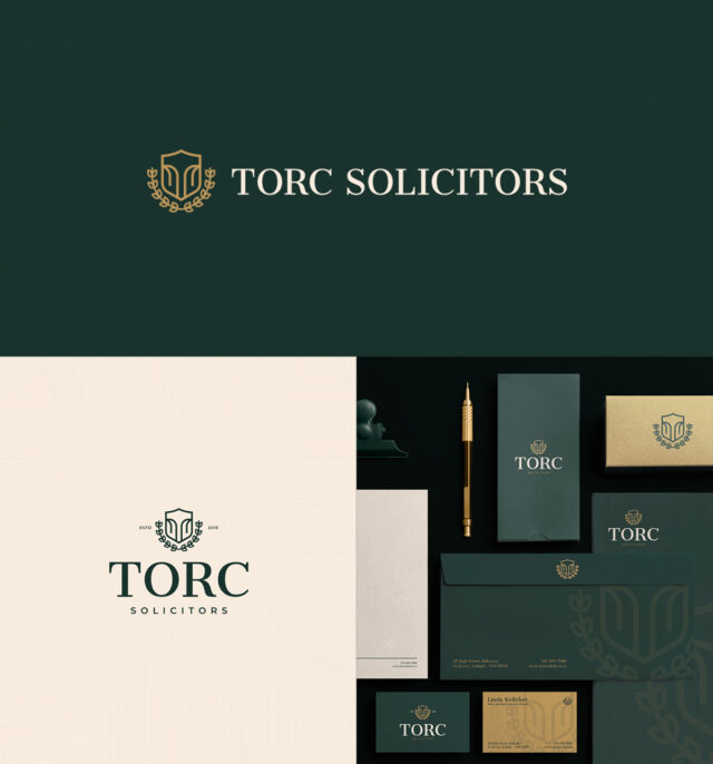
Trusted Symbolism
Torc Solicitors Designed by Dónal Moore Studios
It’s really great when a designer and client work together to find the symbolism and identity in their branding. Torc Solicitors does just that. Their branding depicts the local landmark, combines the letter “T”and the recognizable legal badge to encompass the mark. These clever elements allow the firm’s message to stand out with clean typography and the elegant colour palette.

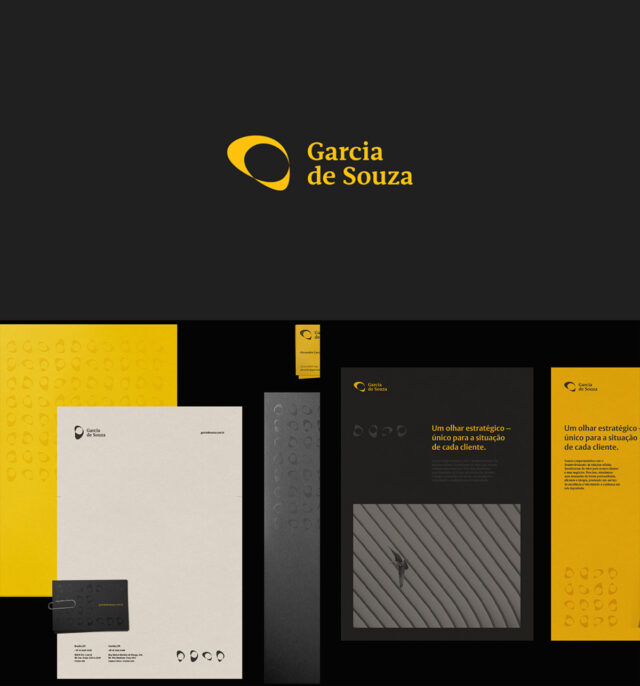
The Strategic Look
Garcia de Souza Designed by Future Brand
For a law firm that represents those all over the world in diverse segments, Garcia de Souza’s brand design has a strategic look which is unique for each client and situation. The earth muted colour scheme comes to life with the organic logo mark and punch of yellow as an accent colour. Overall, this is such a bold brand, while having the ability to remain simplistic.

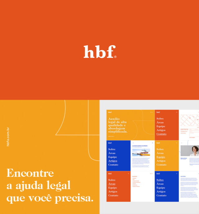
Vibrant & Modern Take
HBF Law Firm Designed by Vladimir Raineri
Is there anything better than an up and coming law firm wanting their branding to reflect just that? HBF Law Firm is such a glorious take on vibrant, modern, while still being serious. The organic, flowing line contrasts with the bold slab serif type in a way which can be cleverly used across all branded material. Now if only their website was as strong as their branding…

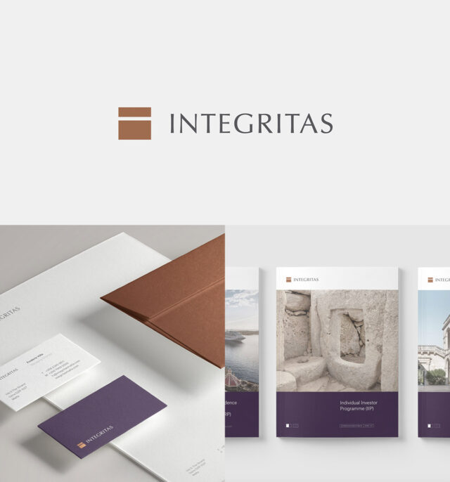
Centuries-Old Inspiration
Integritas Group Designed by Projet Noir
This colour scheme is one for the books. With such a nod to the history and corporate mindset, Integritas Group branding encompasses what they do and who they are. The designer pulled the simplest inspiration from slabs within the architecture and balanced it with the uppercase type to present a sophisticated and minimalistic identity.

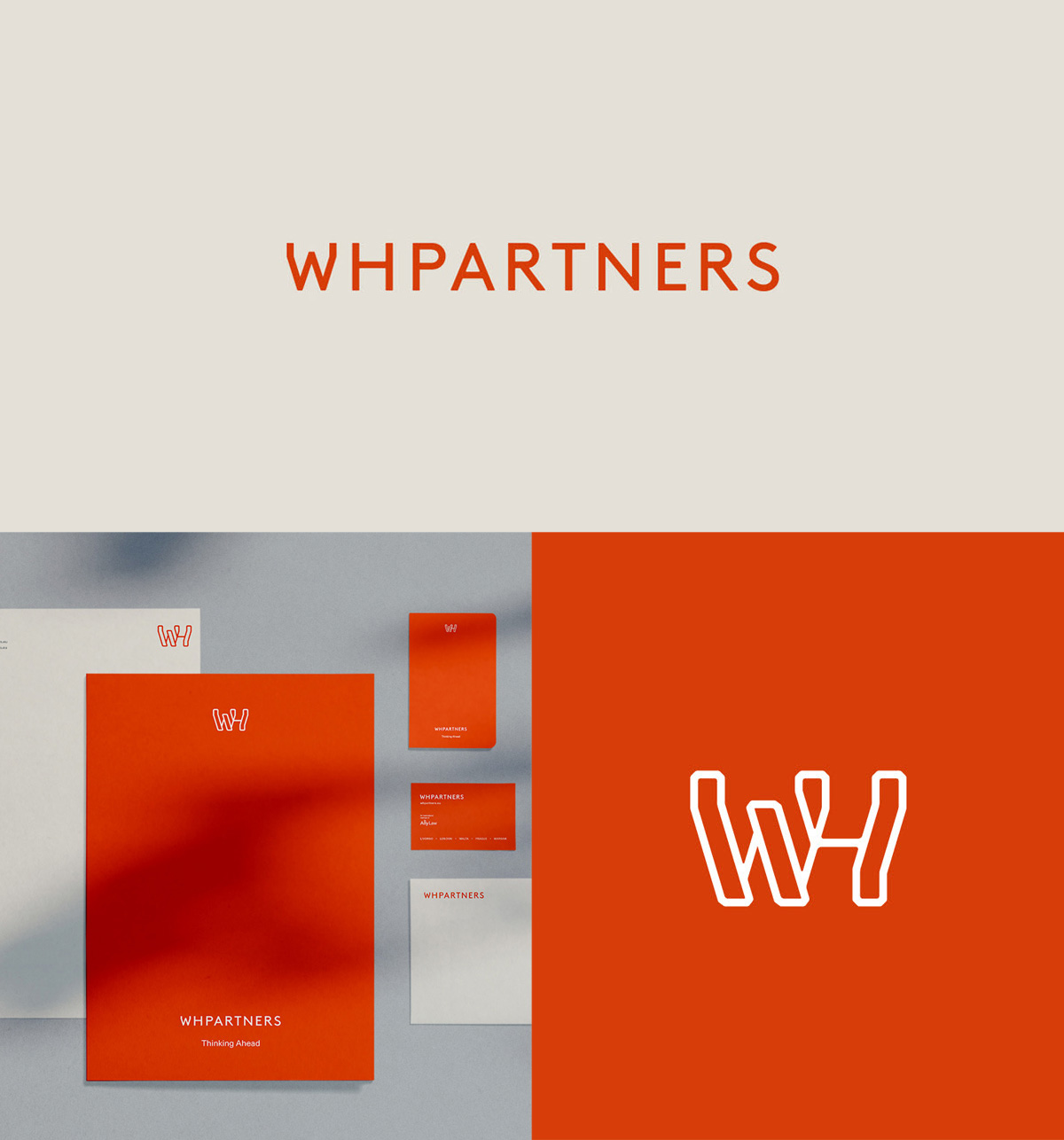
Bold & Unconventional
WH Partners Designed by Hangar Agency
WH Partners is a law firm with an unconventional personality with a twist on the normal ‘law firm’ look and feel. WH Partners’ branding really speaks to the innovation behind their voice and communicates the firms’ unconventional approach which distinguishes it from competitors.
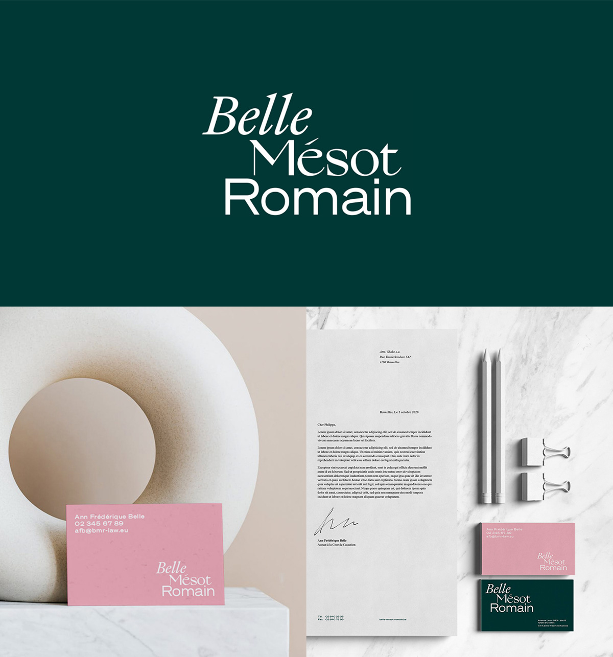
Personalized Approach
Belle Mésot Romain Designed by Shake Agency
Belle Mésot Romain is an independent law firm with a personalized approach reflected across all branded material. There is a harmony which is created from the logo’s three different fonts, derived from having three attorneys. The modern colour scheme and playful type can launch this firm’s branding above competitors.
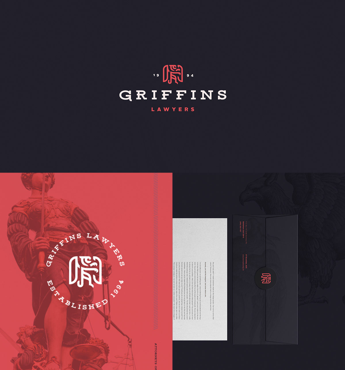
A Trusted Legacy
Griffins Lawyers Designed by Novatur Design
There’s something about this law firm’s branding that most try to achieve. We believe it’s the bold identity, level of prestigiousness and trust which you feel right off the bat. The branding has mixed clever images and illustrations to pair with the heavy display font – all which bring modernity to the law world.
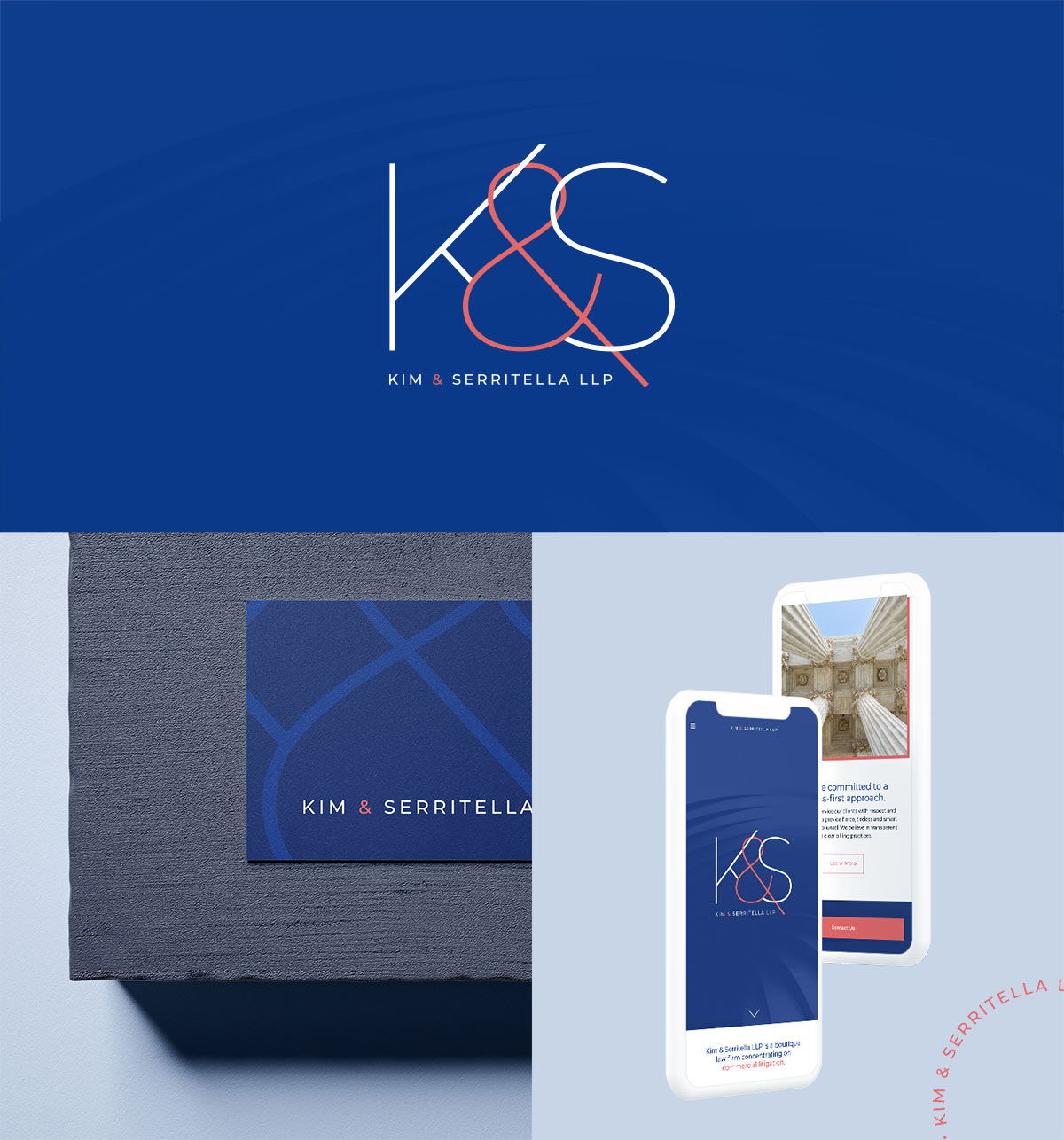
Refined Simplicity
Kim & Serritella LLP Designed by Beam Local
Minimalism doesn’t always have to be black and white. Kim & Serritella wanted to focus on the simplicity and a vibrant colour scheme. We paired the modern colours of cobalt blue and the peach to be the big wow factor, while the rest of their branding through print to web remained quite simple. Balancing these colours with historic and classic photography allow their brand to remain refined, yet modern.
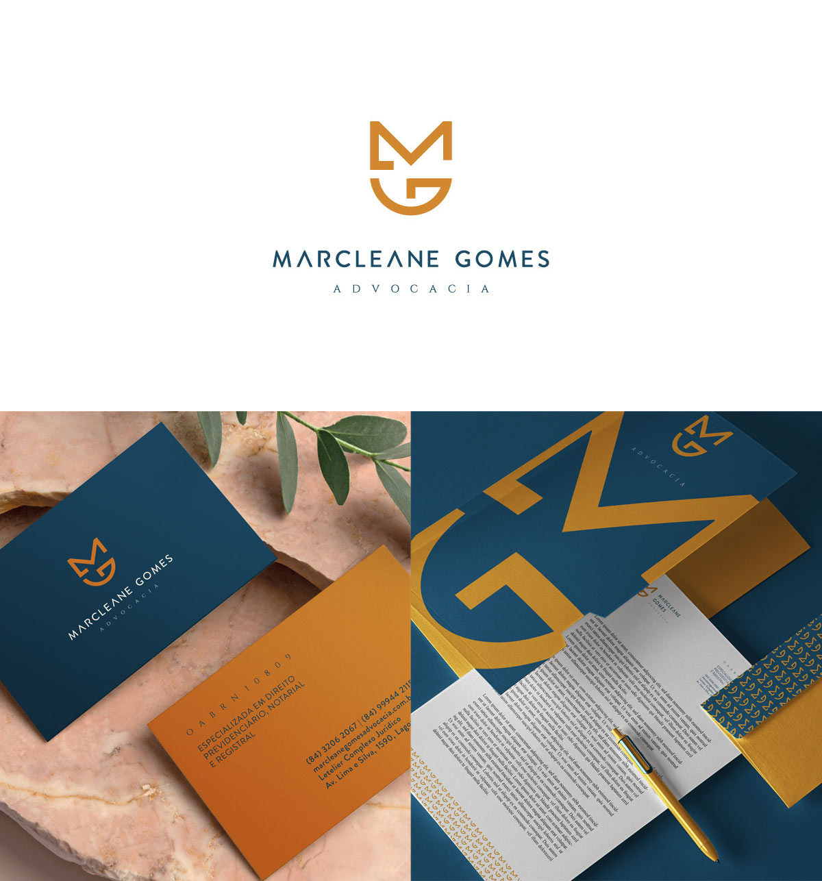
Values of Power & Balance
Marcleane Gomes Advocacy Designed by John Willian
This law firm’s logo cleverly reconstructs the recognizable badge used by many within the industry. By creatively manipulating the letterforms, Marcleane Gomes Advocacy’s logo uses the initials which honours the values of power, trust and protection in its construction.
Are These The Best Lawyer Branding for 2021?


Let an expert guide you.
Beam Local helps professionals launch better websites, outrank their competition on Google, and attract better customers for their businesses.
Or Call +1 (855)-831-4530 and Ask for Kyle