Best Lawyer Logos for 2019
NEW / The Best Lawyer Logos & Branding of 2021
Our popular posts on the best lawyer websites from 2016, 2017, 2018, and 2019 have helped inspire lawyers to build a beautiful, performance driven website for their legal practices. But an element of every website which is also critically important is the branding and logo. If you’d like to leave a lasting impression, build credibility, and distinguish yourself from your competition, designing a logo for your legal practice with the help of a professional designer is essential.
To that end, we’ve scoured over 1,000 legal websites and lawyer logo design projects to assemble this list of the best lawyer logos for 2019 for your inspiration.
If you’re interested in having a new logo designed for your legal practice please get in touch for a free consultation with our team at Beam Local today.
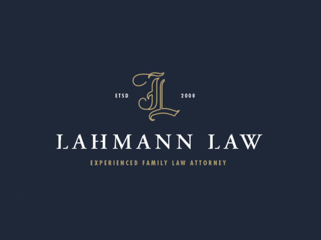
Lahmann Law – Logo Source
Raising the Bar
Lahmann Law certainly raises the bar with this sophisticated, straightforward logo design. The use of classic typography for the “L” as their symbol combined with the gold highlights helps this identify to exude a strong sense of achievement, prestige, and elegance. The combination of a serif typeface for the main law firm name with a sans-serif subheadline is a nice contrast as well. It’s easy to envision potential clients trusting the competency of a law firm with a logo like this.
Pannu Law – Logo Source
Modern Twist
Pannu Law has taken the traditional shield or badge symbol and infused it with a modern twist through the distinctive use of the cuts on the left portion and right portion. It also subtly emphasizes this division and gives the identity a sense of depth through the use of two slightly different shades of blue. Blue is also often associated with intelligence and friendliness, making the impression this logo conveys to potential clients a strong one.
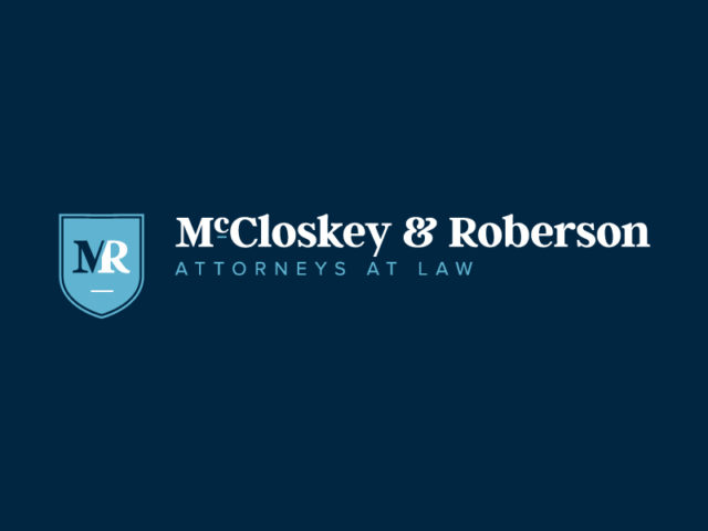
McCloskey & Roberson – Logo Source
Badge of Honor
This logo for McCloskey & Roberson is traditional, but effective. The “MR” monogram inside of the classic shield conveys a sense of unity and strength. There’s even nice minor details such as the white line at the bottom of the shield being similar to the blue line at the bottom of the C in the full firm name. These sorts of minor details might not be noticed by everyone, but they help to create visual cohesion for your brand, which in turn makes your identity stronger and more unique, even if subtly.
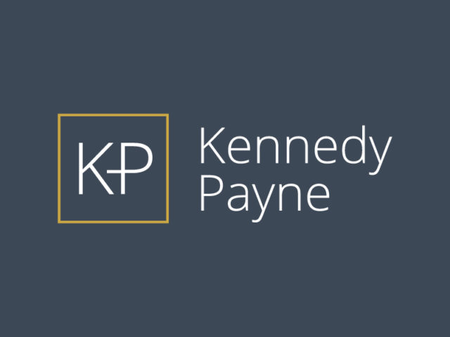
Kennedy Payne – Logo Source
Striking Staple
When you’re a sole practitioner, what should you brand be? In many cases the answer is somewhat simple: yourself! This logo for sole practitioner Kennedy Payne conveys her full name in a straight forward, clean manner. But that alone would feel too generic; it is supported by a strong, but simple “KP” icon along the left-hand side. This logo is efficient and and easy to understand.
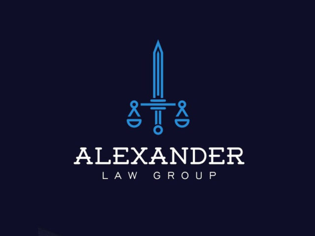
Alexander Law Group – Logo Source
Bold Defense
Sometimes traditional symbols of law and justice can come across as too generic and might cause you to get lost in the crowd. In this logo for Alexander Law Group however, they’ve taken the scales of justice–and all of the meaning carried with them as a symbol–and combined them with another strong symbol–a sword–to manufacture a memorable and meaningful logo for their brand. Creating something truly original like this while still imbuing it with meaning tied to an age old symbol is a difficult task, but if you can do it, your law firm will benefit greatly.
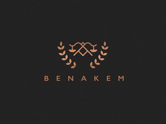
Benakem Law – Logo Source
Elegant Gradient
While the design world has been trending towards flat logos–those with just solid colours–there is still something elegant about those making use of slight flourishes such as gradients. The copper like gradient in this logo helps it to stand out from the crowd.
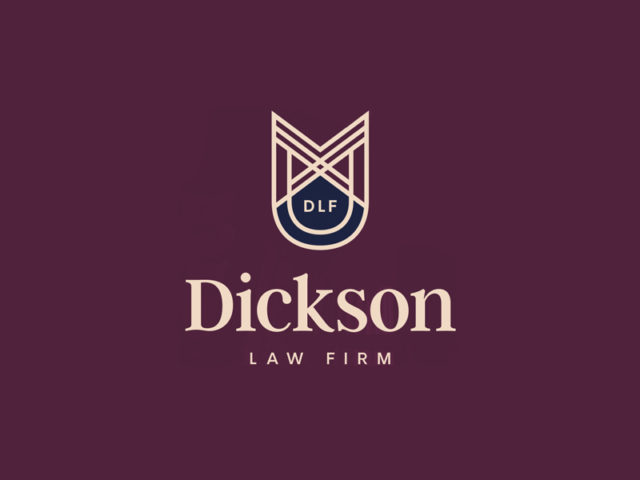
Dickson Law Firm – Logo Source
Intricate & Meaningful
The star of this logo is the shield symbol. A regular shield carries valuable meaning on its own, but within this logo it goes beyond that to integrate the initials of the founder’s (MDD) into the shape of the shield itself and even a subtle reference to the founder’s baseball history.
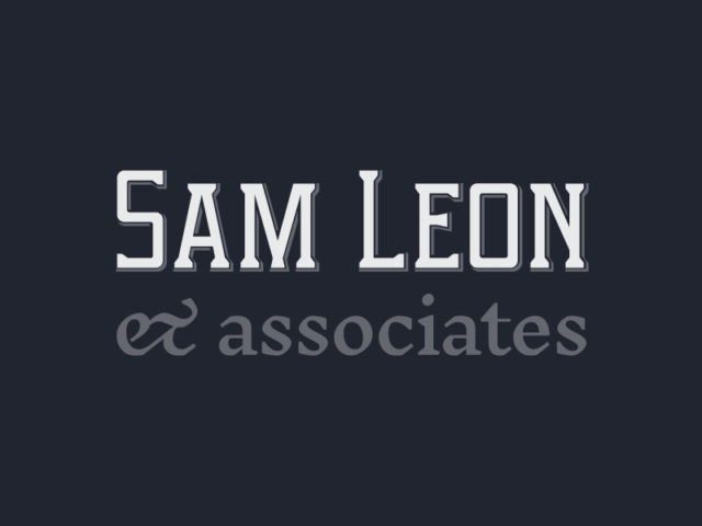
Sam Leon & Associates – Logo Source
Bold Typography
Many logos employ symbols to help them become more memorable in the minds of potential clients, but sometimes strong typography can make up for that and place more focus on the name of your brand. Like it does here for Sam Leon & Associates. Through the use of the two tones: white and grey, the emphasis is clearly placed on Sam Leon as the head of this firm. If you’re running a firm predicated on the name of a particular lawyer, this direction could be right for you.
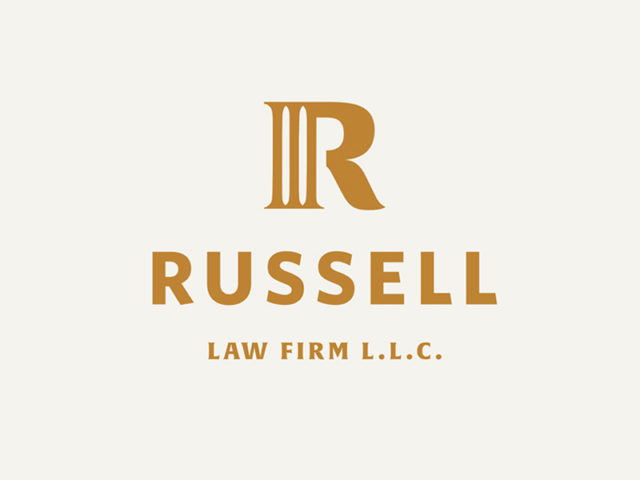
Russell Law Firm – Logo Source
Smart Shape
We love the unification of the pillar and R in the symbol of this logo. It’s another example of how you can use an often overused symbol (in this case, the pillar) in a smart way to make it memorable and relevant for your brand.
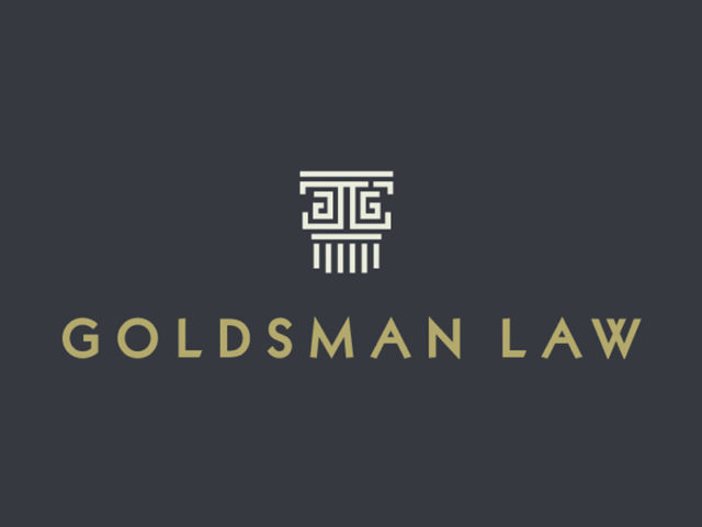
Goldsman Law – Logo Source
Hidden Details
This logo for Goldsman Law is similar to the one for Russell Law firm in that they’ve found a smart way to integrate a letter into the pillar symbol. But a small difference with this one is how the implementation feels more subtle than the one for Russell Law Firm. It’s important to remember when developing your logo and brand identity that being obvious isn’t always the answer. Subtlety and nuance convey a sense of authority and skill.
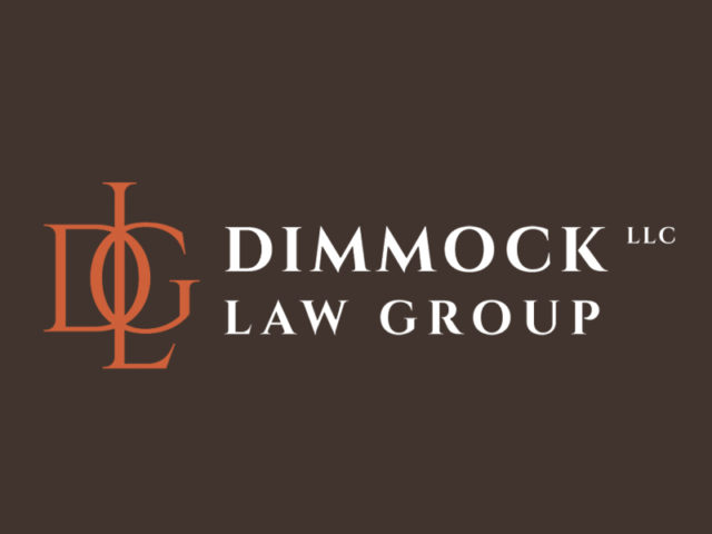
Dimmock Law Group – Logo Source
Classic Monogram
Monograms have been around for thousands of years, and there’s a reason why. They just work. If you can craft a balanced, eye-catching monogram for your law firm, it’s a proven way to lend credibility to your brand image like it has for Dimmock Law Group.
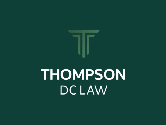
Thompson DC Law – Logo Source
New & Iconic
This is one of our favourites on the list. The usage of the pillar symbol evoking the “T” in “Thompson” is extremely clever. We also love the smaller details such as the angled edges on each of the lines in the pillar. It’s very modern.
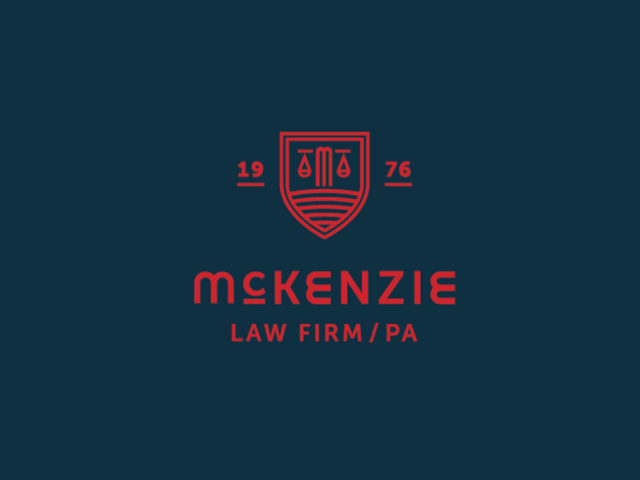
McKenzie Law Firm – Logo Source
Bold Statement
You don’t always see this, but if you firm has a long enough history, including the date in your logo is an option worth considering. Aesthetics of the logo aside, there will always be a sense of weight and trust associated with a firm in the eyes of a client if they see that they have been in business for 20, 30, 40 years or more.
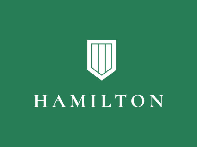
Hamilton Law – Logo Source
Visual Contrast
This shield-based logo has a nice contrast going on between the symbol and typography. While the shield is designed using all sharp angles and tightly fitted pieces, the “HAMILTON” type uses a classic serif typeface with relatively large space between each letter. It’s almost as if the symbol conveys the strength and power of the firm itself while the open and airy typography conveys a sense of openness and trustworthiness to those looking at it.
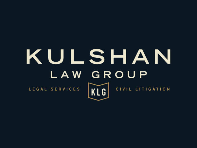
Kulshan Law Group – Logo Source
Strong Advocacy
Most logos make their symbol the focus when one exists. In the case of Kulshan Law Group, they’ve flipped that common tendency around and made their “KLG” badge a smaller element below their full name to separate the listing of the two pillars of their business: legal services and civil litigation. Often times, people will view your logo on smaller devices anyways, so it’s important to consider how your symbol will appear in those cases. It’s easy to see that for larger applications Kulshan Law Group would use this lockup, while for smaller applications they might just use the KLG badge on its own.
Let an expert guide you.
Beam Local helps professionals launch better websites, outrank their competition on Google, and attract better customers for their businesses.
Or Call +1 (855)-831-4530 and Ask for Kyle