Are these the 10 Best Law Firm Website Designs for 2016?
NEW / The Best Lawyer Website Designs of 2021
We’ve scoured the internet looking at law firms, lawyers, mediators and all things legal to find the best law firm website designs around. We understand that the best sites are equal parts beauty and performance. We’ve graded them for you below.
Check out our posts of the best lawyer websites for 2017, 2018, 2019, and 2020 as well.
1. Avellum
VISIT WEBSITE
Beauty 7/10
Performance 7/10
Content 8/10
Why we love it.
This legal site is organized and well thought out. One feature that stands out is their “Legal Alerts” page that has up to date changes in the law that might apply to their potential leads. This feature also has the potential of acting as a conversation starter with leads!
We can appreciate great professional photos when we see them. Potential leads like to see who you are, putting a face to a name is an essential step in converting a lead, websites are a visual tool afterall.
What we’d improve.
We’d put the social links on the footer of every page and not just on the “contact” page. This integration makes it as user friendly (and shareable) as possible.
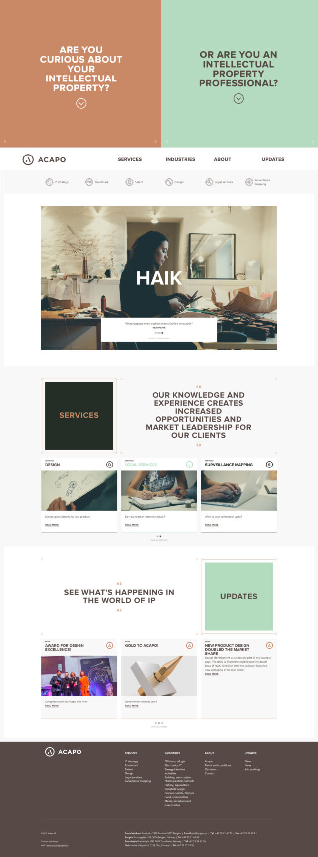
2. Acapo
VISIT WEBSITE
Beauty 10/10
Performance 9/10
Content 7/10
Why we love it.
This site engages the visitor from the get-go by asking a navigating question – it gets the visitor curious about your services and ushers them through to become a lead (and hopefully) a conversion.
Great imagery – the more artistic your audience, the more artistic your site needs to be or you’ll lose their attention and trust.
We (and your visitors) do and will always appreciate the personal touch of staff portraits with personal contact information being readily available.
What we’d improve.
Ah Acapo, you had as at hello. Please update your resource library so you can continue to provide value and essential materials to your clients (and hopeful clients).
We appreciate your Twitter and Linkedin links, but neglecting Facebook is never wise – they have the largest audience of any social platform. Larger audience means larger pool of potential leads!
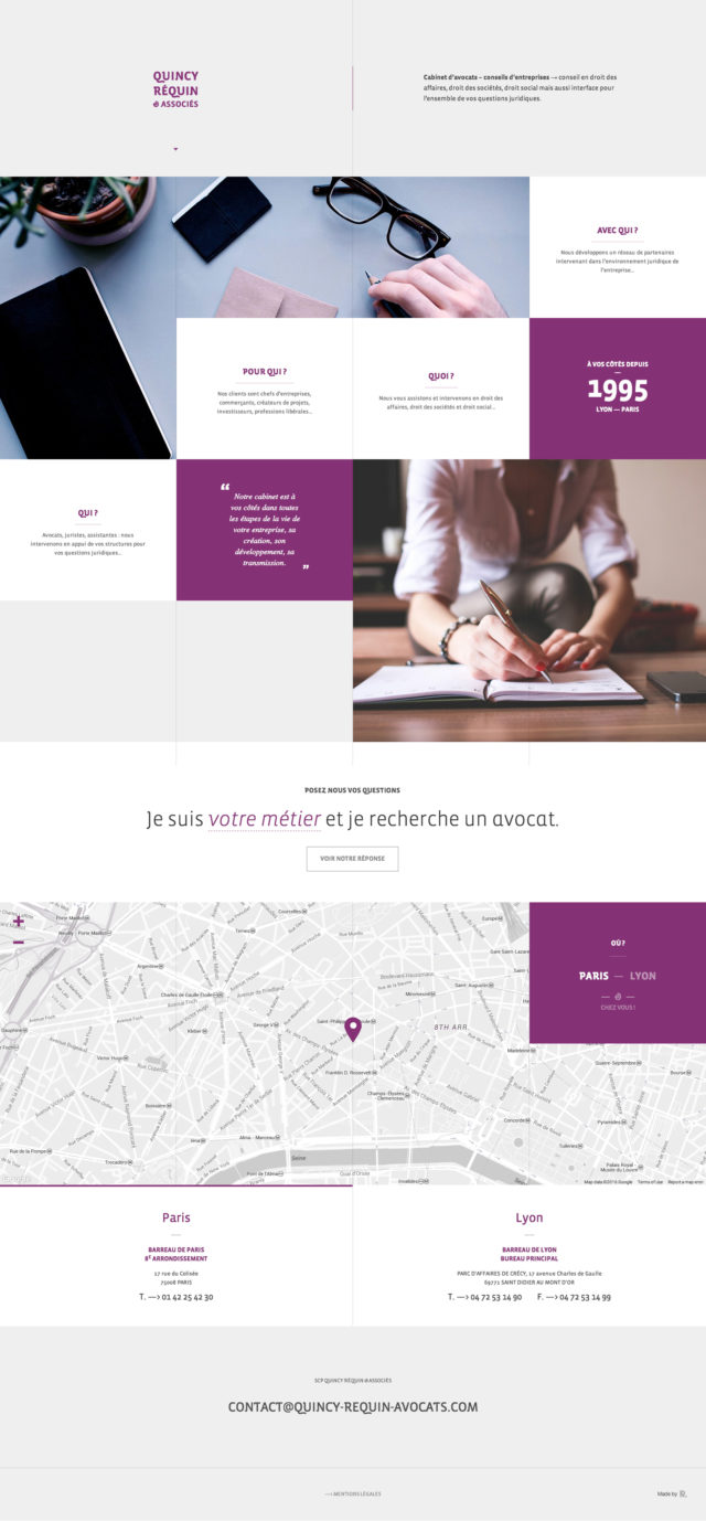
3. Quincy Requin
VISIT WEBSITE
Beauty 9/10
Performance 7/10
Content 6/10
Why we love it.
We appreciate the old journalist tactic of asking who, what, where, etc. it’s to the point without being overwhelming.
The use of clean, professional photos is very important with legal websites. You have to be both professional and re-assuring for your target customer or they won’t trust that you can get the job done, which means that you lose leads to your competitors.
What we’d improve.
We’d like to add a little more content, and a little less transitions on the site.
Bonjour Quincy, we’re big fans of your website! Next steps for you would be to be on social media and integrate your presence into your website using social links. Having a strong social presence isn’t just for celebrities anymore Quincy – it’s imperative for your business.
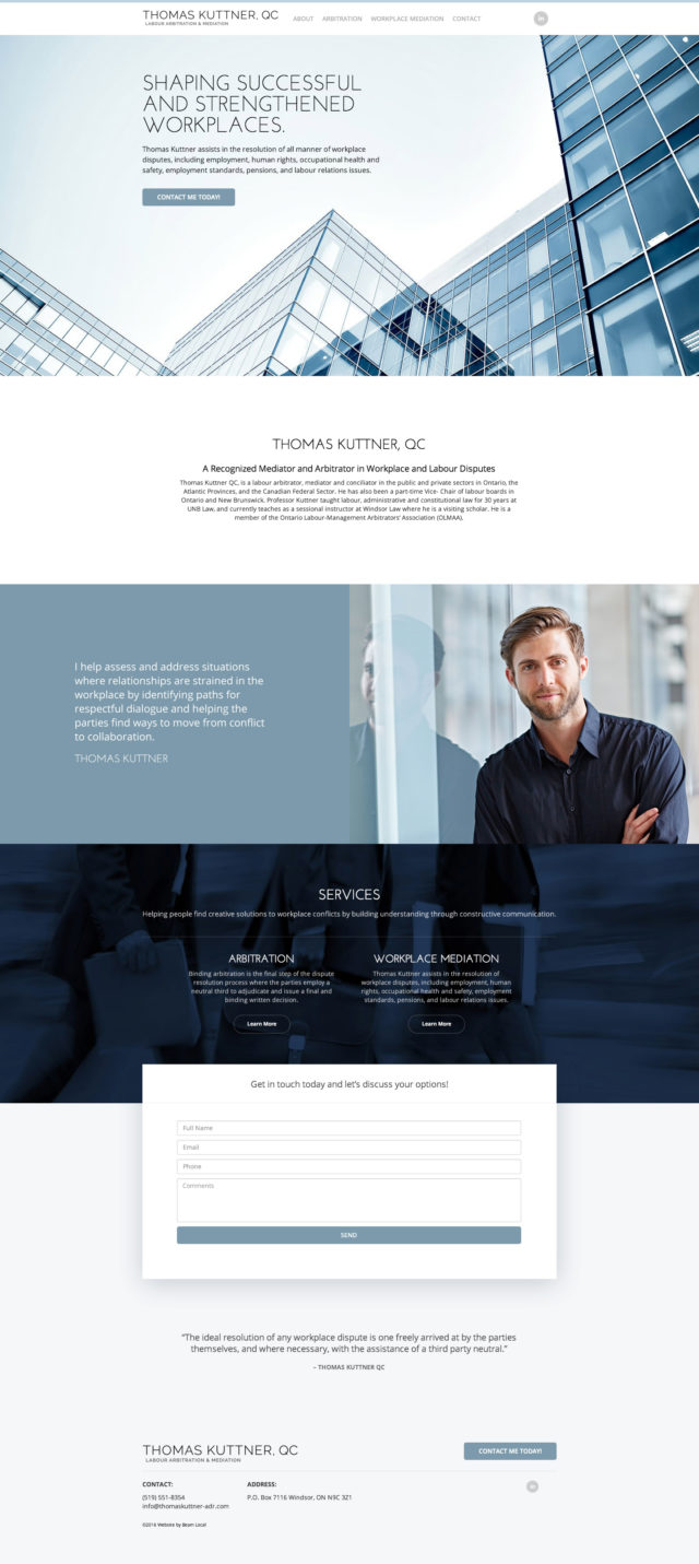
4. Thomas Kuttner
VISIT WEBSITE
Beauty 8/10
Performance 7/10
Content 7/10
Why we love it.
Clean design, easy to contact, clear call to action – all of which will result in more website leads for this law firm!
We particularly appreciate the separate sections of the site for each professional offering, the easier to find your way as a lead, the better!
The calendar feature makes Mr. Kuttner accessible, and more services are having a “schedule yourself” feature, why not your attorney?
What we’d improve.
The only thing we can think of is to see of Mr Kuttner has a professional blog because we’d love to hear more from him! A blog or resource section is a great way to provide added value to your leads so they see you as the expert you are.
5. Robert Weinberger
VISIT WEBSITE
Beauty 8/10
Performance 8/10
Content 6/10
Why we love it.
This is a very fresh lawyer website design, it’s punchy and to the point. No plain jane arial here.
It’s clear who this lawyer is and the markets he focuses on. This always helps with lawyer lead generation. If you can pre-qualify your customers with your website you don’t have to waste time doing it on the phone or in person.
Robert’s personality shines through on the site and like any business making a personal connection is a key step in acquiring a new customer.
Having a list of clients on the homepage helps visitors understand your practice, and potential leads don’t have to dig through your site for these details.
The footer includes social media integration for Twitter and Facebook.
What we’d improve.
While the site is responsive there are some sections which are much less effective (particularly with the image crops) on some smaller devices.
The few copy editing errors, in particular, comma splices, Bobby.
The telephone contact details at the bottom of the page are links that don’t trigger a call, just a “Cannot open page” error message for some browsers.
There’s links to Twitter, and Facebook, but no Linkedin. Seems like this should be a standard on lawyer websites these days.
6. Jenny Odegard
VISIT WEBSITE
Beauty 7/10
Performance 7/10
Content 8/10
Why we love it.
We love the simplicity and bold colours of this website design. It reads like an interactive powerpoint which might not sound amazing, but it comes across well targetted for her niche of creative services companies.
On the plus, she does offer to buy you a drink if you get in touch.
What we’d improve.
We do feel like she might be leaving something on the table as her contact information and lead capture is pretty well buried on the site. We’ve learned that for even the more creative website designs should still focus on converting visitors into leads.
7. Henein Hutchinson LLP
VISIT WEBSITE
Beauty 10/10
Performance 8/10
Content 8/10
Why we love it.
A pretty controversial site for a company who handles pretty controversial cases. (Marie Henein was Jian Ghomeshi’s lawyer.)
We can appreciate that the site has a clean design, but also manages to speak volumes about their team and the services offered.
The site and functionality is great on mobile devices
The overall professional/somewhat intimidating tone (especially in the portraiture) inspires confidence and is well targeted toward the potential client who would need a white collar or criminal lawyer.
What we’d improve.
Henein has been called the ‘fixer’ by Toronto life, but there’s some things we’d be fixing about her site.
The domain name sounds like a tax form, since heneinhutchinson.com is still available we’re not sure why they didn’t opt for that.
The firm stands out in the crowd because of their fashion forward portrait photography but websites need to have layers of indexable content. We’d be interested in reading an interview or tips on white collar crime, and anti-money laundering.
For a firm with such an imposing personality, we would have liked to see them participate with some social media channels. We’d follow them on Instagram.
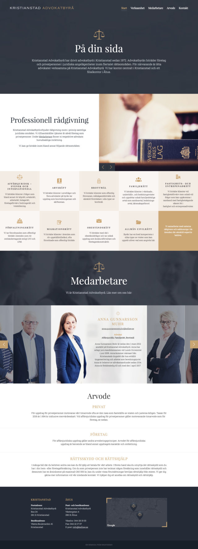
8. Kristianstad Attorneys
VISIT WEBSITE
Beauty 8/10
Performance 7/10
Content 6/10
Why we love it.
Clean and professional design, with just enough detail for potential leads. This lack of crowding is great for leads since they don’t have to sift through legal jargon that they may not fully understand – the less barriers, the better.
This site makes sure to be transparent with legal aid and protection, a transparent website is always desirable for your clients!
What we’d improve.
We’re noticing a trend here; not nearly enough law websites offer social integration. All digital channels should be easy to find, especially for the audience who haven’t chosen a lawyer yet.
9. Lash and Goldberg LLP
VISIT WEBSITE
Beauty 9/10
Performance 8/10
Content 7/10
Why we love it.
Visually appealing law site with eye catching stock photography.
The addition of each team member’s signature is a great way to leave a personal touch for a potential lead. They like to see that you’re all real people, it puts them at ease at a (probably) stressful time.
What we’d improve.
An eerily similar tagline to Bobby’s (Robert Weinberger). It’s imperative to position your firm as unique!
The imagery is beautiful, but lightbulbs and umbrellas don’t really say “professional lawyer website” to us. Instead, we’d add pictures of you at work.
No social links! We cannot stress enough the positive impact of adding social links to your website. If you haven’t started a professional Twitter, Facebook, or Linkedin, go do it now – we’ll be here waiting!
10. Aviso
VISIT WEBSITE
Beauty 8/10
Performance 7/10
Content 7/10
Why we love it.
The introduction text and image really drives home the fact that these attorneys understand their clients and know the value they offer.
These guys set themselves apart from the crowd by actually advertising that they do pro bono work. It’s always a breath of fresh air to see attorneys that give back!
What we’d improve.
We’d add a form at the bottom of the page rather than a clickable email address, the easier to contact you, the better.
The footer indicates that the site hasn’t been updated in three years. Always update your legal site for the most recent lead generating techniques!

Author’s Corner
Sam Gordanier
Hey I’m Sam, the Marketing Coordinator here at Beam Local, where I work on helping my team make great marketing decisions. What do I love about my work? Helping small business owners find uncomplicated ways to grow their own businesses. I’m always on the lookout for businesses who are interested in applying innovative tech strategy to their marketing plans. I’ve worked with hundreds of small businesses, and write content to help business owners get better at running their businesses. When I’m not helping small businesses get better, you can find me on my couch with my cat watching Seinfeld.
Let an expert guide you.
Beam Local helps professionals launch better websites, outrank their competition on Google, and attract better customers for their businesses.
Or Call +1 (855)-831-4530 and Ask for Kyle


