Best Paint Store Websites for 2018
Most paint stores choose to build websites based on templated designs. These templates are often outdated or don’t communicate what makes their particular store unique.
We’d like to help inspire these business owners. So, the website experts here at Beam Local have gone ahead and performed an exhaustive review of over 1,000 paint store websites. The result is our list of the best paint store websites for 2018. Enjoy!
If you’re interested in having a new website designed for your paint store please get in touch for a free consultation with our team at Beam Local today.
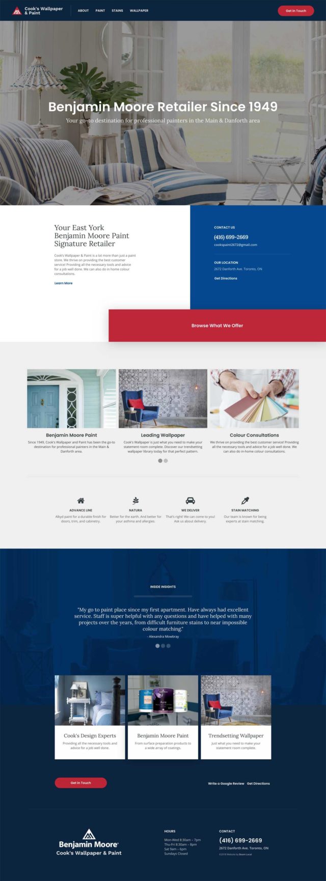
Cook’s Wallpaper & Paint
Perfectly branded and executed paint store website
There’s countless Benjamin Moore retailers who don’t convey a sense of professionalism and sophistication with their website. Cook’s Wallpaper & Paint is one of the few exceptions.
Cook’s Wallpaper & Paint is branded strongly to convey that they are a legitimate Benjamin Moore retailer. Their site is also mobile responsive without compromising their eye-catching modern layout. A clear content structure, obvious call-to-actions, and slick subtle animations make this website one of the best paint store websites for 2018.
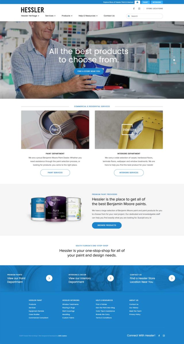
Hessler
Solid grid, style, and content architecture
We’ve included this site for Florida-based Hessler not so much for the homepage alone, but for the quality of the design and structure throughout.
Starting right from the top, the site is divided into two primary sections: Paint and Interiors. Within each section Hessler has made pages easy to browse with a strong grid-based layout. The clean stylesheet, branding, and content architecture also contributes to this.
It’s easy to switch back and forth between the two sections. Within each one, smaller details such as icons representing their different product lines in the dropdown menu and subtle hover animations on the featured items at the bottom of most pages help to make this one of the most professional, refined, and easy-to-browse paint store websites of 2018.
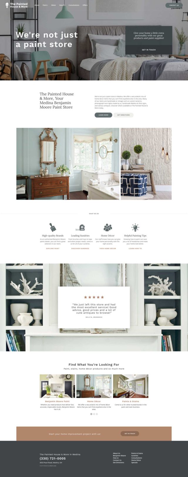
The Painted House and More
A fine balance between photography and product information
The website for The Painted House and More carries with it a strong emphasis on the balance between photography and textual content.
The first example of this is right at the top in the header. It presents a headline as expected, but it also contains a bold call-to-action box. This box helps to make it clear for users what they provide and how to get in contact with them right away.
As you scroll down, more detailed sections with text describing what they offer are broken up with imagery or supplemented by imagery (in the case of the Reviews background). This approach gives users breathing room between the more intensive, information-filled sections.
For a paint website, it’s important to convey not only specific information about the products you carry, but to also sell an idea. The idea being what a customer’s space can be transformed into. The Painted House and More strikes a fine balance between these two things, helping it to make it stand out amongst the crowd on our list of the best paint store websites of 2018.
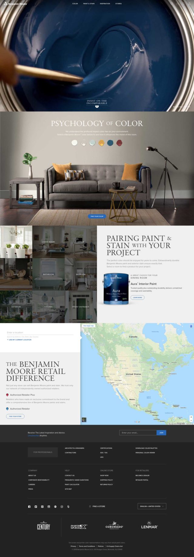
Benjamin Moore
Auto-play video header captures your attention
As one of the big players in the industry, Benjamin Moore has gone the extra mile with the functionality of their site.
While the site is structured in a classic stacked, split fashion, each section presents engaging functionality. The auto-play video in the header is an incredible mood-setter and captivates users immediately upon page load. The “Psychology of Colour” section allows for you to switch between various colour options by clicking on the swatches. The following section with the grid of images for each room type gives you suggestions for different paint options. Finally, they finish with an interactive map allowing you to find retailers near you.
Each section on Benjamin Moore’s website is deliberate, purposeful, and engaging. That’s the mark of an effective website.
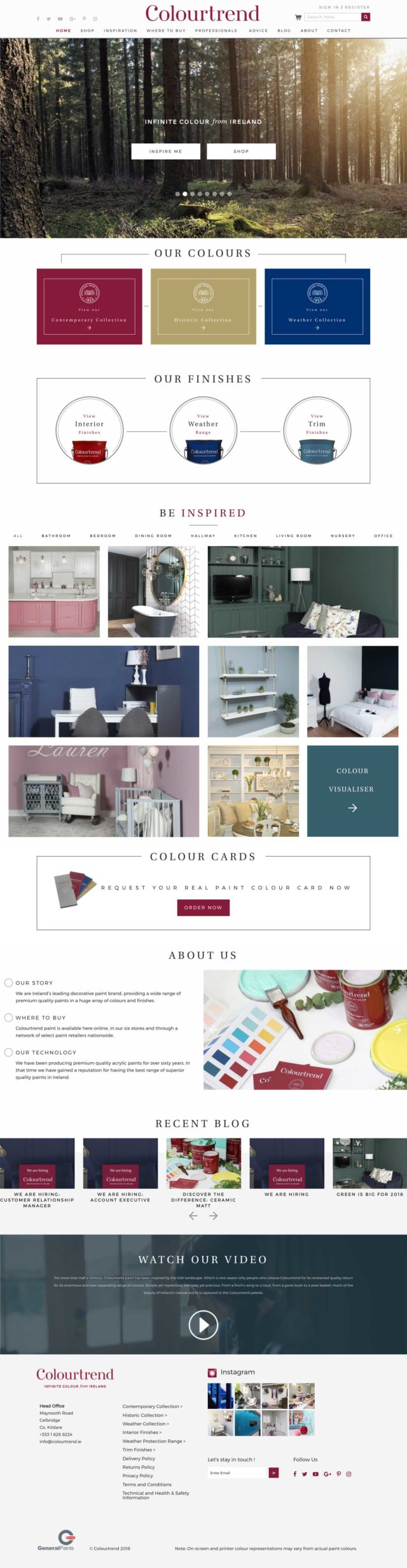
Colourtrend
Consistent and visually dynamic at the same time
Ireland-based paint brand “Colourtrend” hedges its bets on driving users into two distinct areas of their site from the header: “Inspire Me” and “Shop”. Beyond that, it produces an easy-to-follow structure with consistent section header styles as you scroll down the page.
The section header styles being consistent help to act as an anchor for the user to explore the more varied section designs they introduce.
When designing a website it’s important to find the right balance between visual interest and the consistency of a system. This helps the user understand what they are browsing without getting bored. Colourtrend is trending in the right direction when it comes to this aspect, earning itself a spot on our list of best paint store websites for 2018.
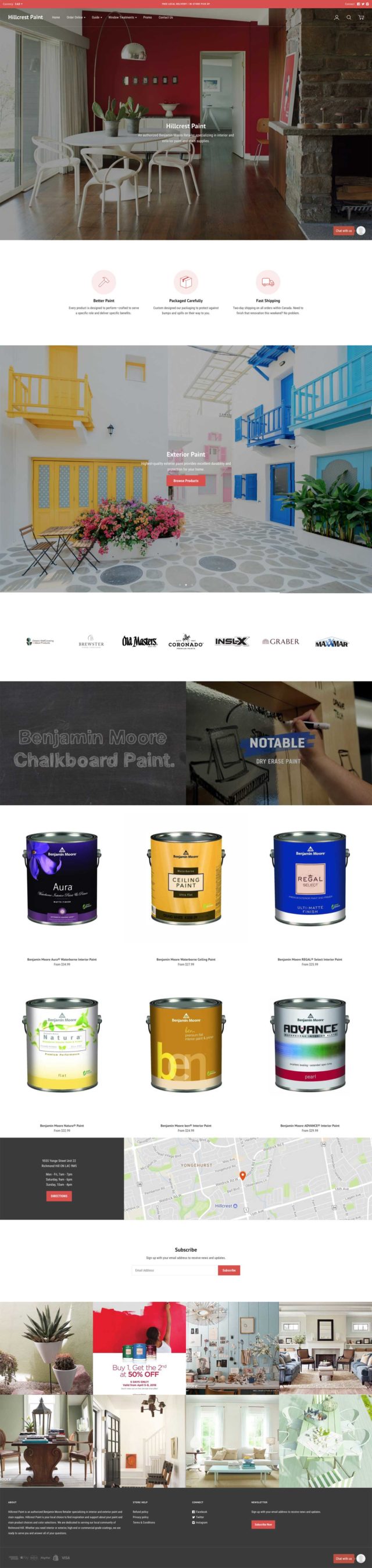
Hillcrest Paint
Simple, speedy, mobile-first design
This is one of the most simple websites design-wise on our list of best paint store websites for 2018. It is also one of the speediest in terms of page load times.
The interior pages on the site seem to have been designed with a very narrow column width. This is strange at first glance but does make the site less overwhelming to consume and easier to translate to mobile. In fact, a mobile-first strategy was probably employed when designing this website.
For some brands, exploring a more unique and dynamic design fits. But sometimes a more simple, straightforward, and modern approach is actually more effective. For Hillcrest Paint, this seems to be the case.
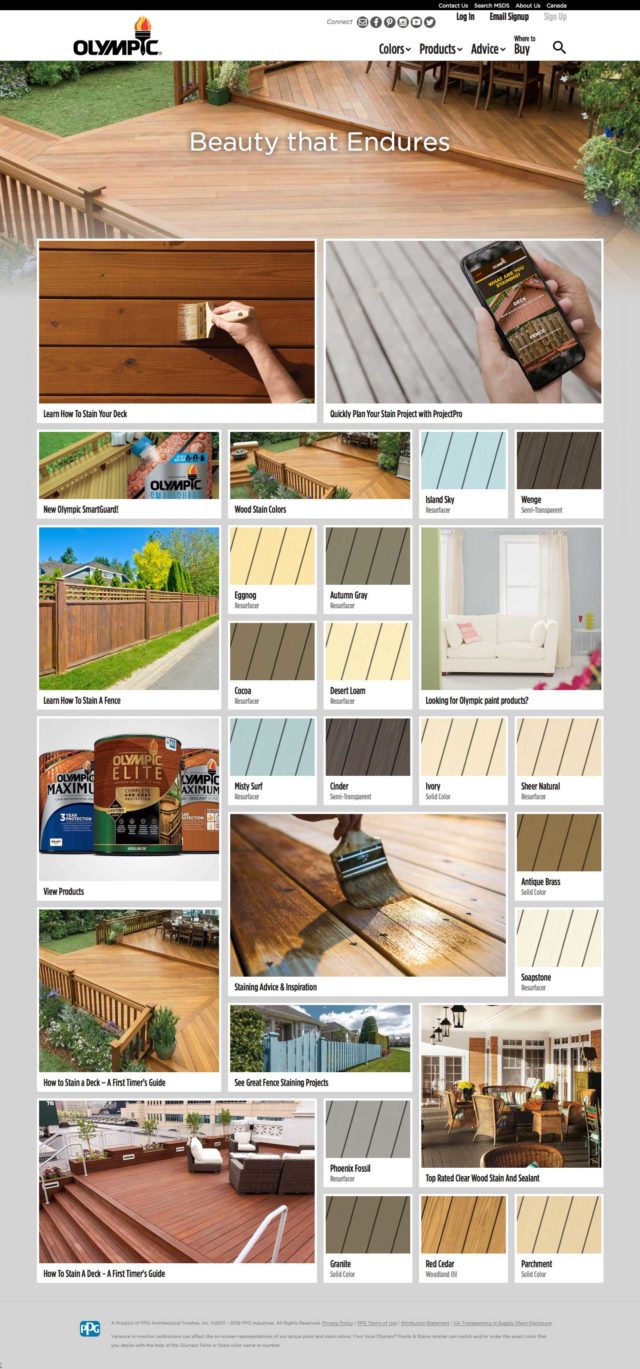
Olympic Paint
Inspiring Pinterest-esque grid design
If you’ve spent time thinking about renovating or painting your home, you’ve also spent time looking for inspiration to help you decide what to do. Olympic Paint has taken that and turned it into the entire concept for their website homepage.
Filled to the brim with content in a masonry grid design, their website does a great job at aggregating and presenting a wide variety of blog content and colours all in one spot.
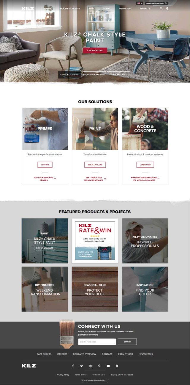
KILZ
Physical design touches help this website stand out
KILZ offers a basic, solid site design but what made it stand out for us was the touches of physicality throughout. Most websites use hard edges to break up different sections. But KILZ instead utilizes brushed edges on some sections. This brings a sense of texture and reality to the layout itself which doesn’t exist on any of the other websites we’ve included on our list this year.
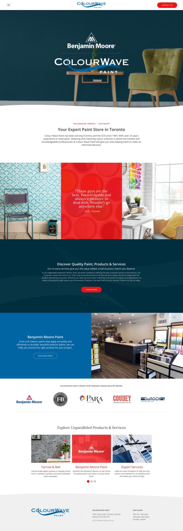
Colour Wave
Colourful and fun without being overwhelming
It’s rare to see a website which can so seamlessly integrate a concept from their logo into the site design. You see this immediately at the top and bottom of each page on Colour Wave. There is a wavy line cutting between the header and body as well as the footer background.
This line help sets the mood for what is also a very colourful and fun site. Given that paint stores commit themselves to offering a variety of colour options to their clients, this approach seems appropriate.
It’s hard to balance a wide colour palette (and also various patterns/textures throughout) without it feeling overwhelming. But ColourWave manages to do this effectively with their three core colours: red, blue, and navy.
Let an expert guide you.
Beam Local helps professionals launch better websites, outrank their competition on Google, and attract better customers for their businesses.
Or Call +1 (855)-831-4530 and Ask for Kyle