Best Lawyer Website Designs for 2018
NEW / The Best Lawyer Website Designs of 2021
We’ve put together the definitive list of the best lawyer and legal website designs for 2018. Attorney and law firm website designs have come a long way since our original best lawyer websites for 2016 roundup. The competition for this years list was fierce and our team hand picked this list after reviewing over 2,000 legal websites which is 1,000 more than we reviewed last year for our best lawyer websites for 2017 awards.
Scroll down to browse some of the most beautiful and performance driven legal websites in the world. It’s an all new list for 2018. Enjoy.
If you’re interested in having a new website designed for your legal practice please get in touch for a free consultation with our team at Beam Local today.
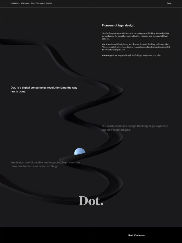
Dot.
Simplicity and a fresh design help this unique firm stand out in a crowd.
The simplicity of Dot.’s website is its strongest asset. Most lawyer websites are overwhelming in their presentation of as many elements as possible on their homepage as is possible. Dot.’s own philosophy of trying to design useful, usable and engaging legal services is therefore reflected in their modern, distilled, easy to follow, and slick website design.
Some nice touches include the playful dot animation on the homepage which draws users down the page naturally and their usage of coloured modal windows on interior pages when additional information is needed. They might be missing out on some SEO value by putting additional content into modal windows instead of new pages, but it is extremely user friendly nevertheless.
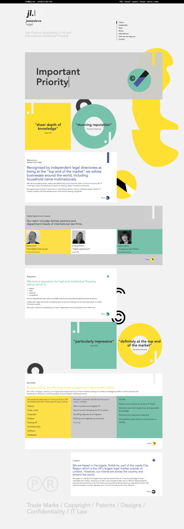
James Love Legal
A playful and engaging approach.
The James Love Legal website is a good example of how a bright colour palette, subtle animation, and ‘breaking’ the grid through the use of different graphic shapes like circles and rectangles/squares of varying lengths can help to enhance the visual interest and readability of a website. This site presents a lot of information even on the homepage, but it is made more manageable to digest by the engaging layout afforded by those previously mentioned elements.
Their use of quotes throughout the site in the more unique shapes of the site helps to validate their law practice at every turn, something which is important to users looking browsing different lawyer websites in search of their right fit for them.
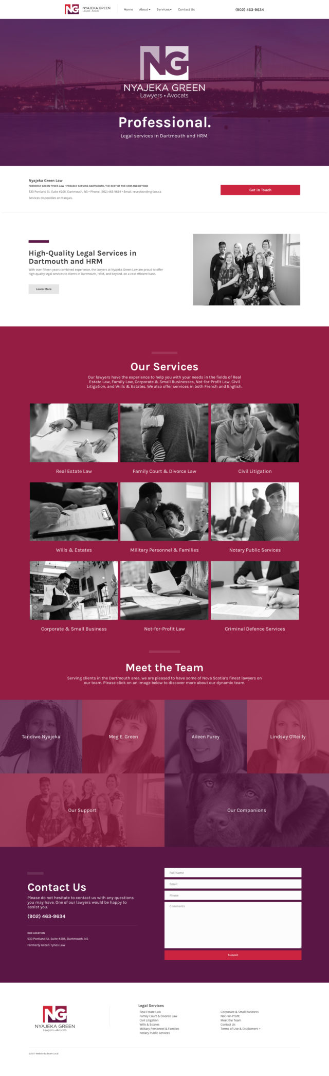
Nyajeka Green Law
This is what a legal website should be.
Everything about the Nyajeka Green Law website is easy to understand and approachable. Right from the top, the header communicates their three key points: Cost Efficient. Friendly. Professional. That’s enough to put anyone looking for a lawyer at ease in an area where many people might be overwhelmed by complexity or worry.
Following that, is a call to action, a large grid of services, their team members, and a contact form which also appears on every page to drive new leads which is always an important element to consider in lawyer website designs.
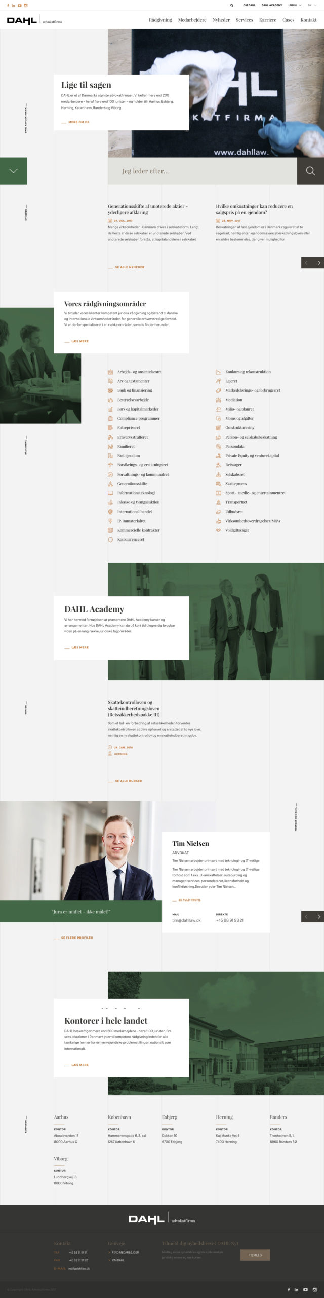
Dahl Law
It feels so well designed and organized.
Dahl Law Firm’s website is impressive on many levels. The modern design and structure of the site help to artfully display and connect a wide variety of legal topics together seamlessly with their own team. We particularly like how the interior service pages link to “Experts” in that particular field; as a firm which employs over 200 people, they have clearly taken the time to ensure their specific expertise in each area of law they cover is understood.
The clean design, great animation, finely tuned and presented information architecture, and touches such as the sophisticated search bar and engine on the homepage help distinguish this as one of the best lawyer website designs of 2018.
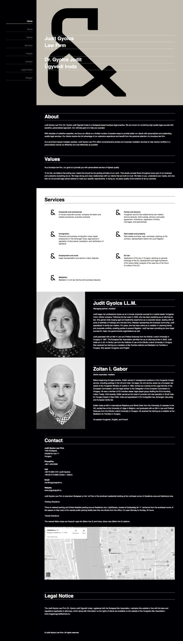
Judit Gyolcs Law Firm
The bold ampersand leaves a lasting impression.
Sometimes restraint is a virtue, and it is put to great effect on this single page website for Judit Gyolcs Law Firm’s website. The distinctive locked left-hand side navigation links to each section of the site and highlights as you scroll down, ensuring that a user never gets lost.
With the site being just one page and the navigation method being so strong, we feel this lawyer website does an excellent job of quickly communicating three of the most important things every website always intends to convey: “Who are you?”, “What do you do?”, and “How can I contact you?”.
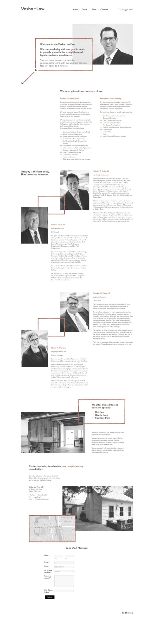
Vesha Law Firm
Feels like the modern art museum of legal websites.
The site for Vesha Law Firm is actually quite similar to Judit Gyolcs Law Firm’s website in the sense that it is also a single page and uses a locking navigation which highlights each label as you scroll down.
The simple structure of the site helps to clearly communicate the basics of what you need to know about the services they offer and their team before you contact them to proceed further. We also appreciate the contact information for each team member being readily available, as well as the elegantly implemented animation of each element as you scroll down the page.
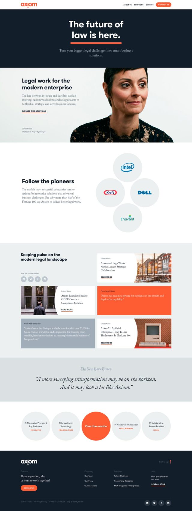
Axiom
The structure encourages a deep dive.
As one of the leading legal service providers in the world, Axiom’s website is–as expected–extremely well refined and presented both from a design and messaging standpoint.
Many smaller law firms make the mistake of thinking they need to throw everything they can on their website, and on the other hand, there is perhaps some that put too little content on their sites. But Axiom seems to have found a happy medium in the sense that their messaging is easy to understand, but additional details through things like case studies of their clients is available if you want to dive deeper. Pages like these are valuable not only for users to learn more about what you do within the context of the real world, but for search engine optimization as well.
In terms of the design, we appreciate their bold colour palette and headlines, and on their Solutions pages, interactive charts and graphs.
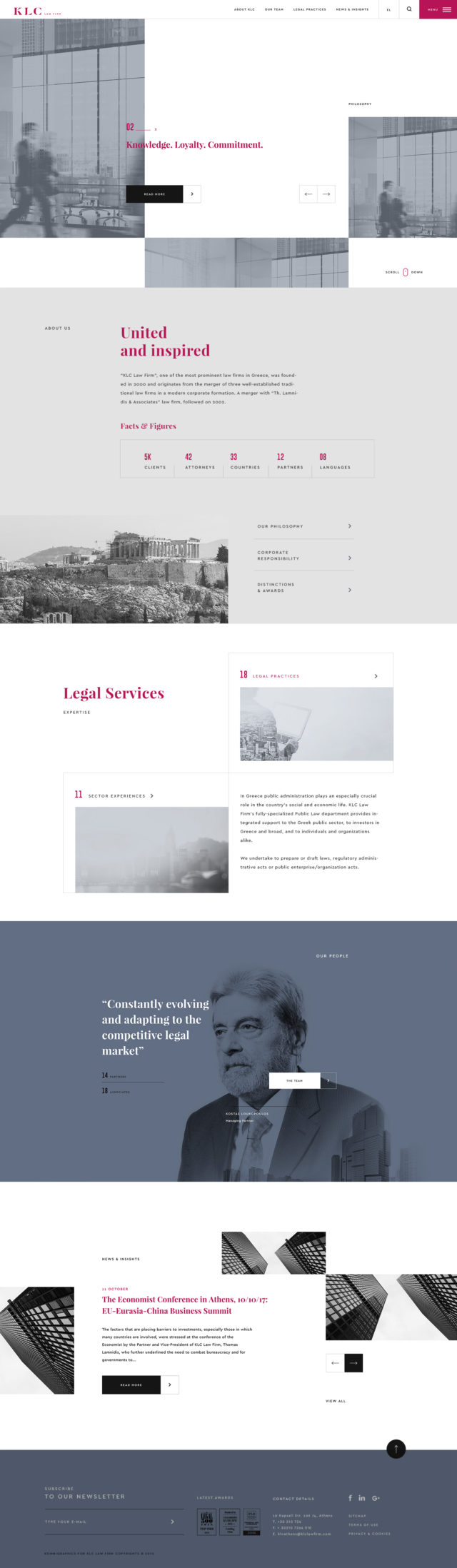
KLC Law Firm
An absolute design trendsetter for law firms.
KLC Law Firm’s website demonstrates a staggering attention to detail when it comes to design and layout. They do a great job particularly on the interior pages ensuring that a user understands at all times where they are located within the structure of the website through the use of breadcrumbs. They also make it easy to jump from one page in a section to another via the use of left and right arrows near the titles on each interior page.
Although the level of variation in the layout and animation can be a little bit overwhelming at times, this is certainly one of the most modern feeling websites on our list of best lawyer website designs 2018.
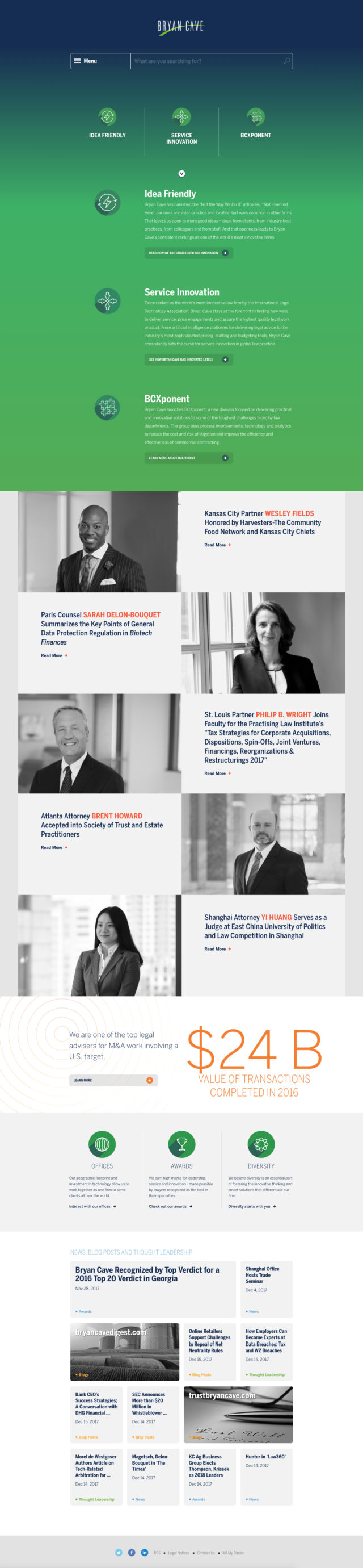
Bryan Cave
That beautiful green gradient.
Like Dahl Law Firm’s website, Bryan Cave’s website places a strong emphasis on information architecture and employs a similarly sophisticated demonstration of connections between each type of content on their site. If you’re going to build a lawyer website and need to express a wide range of services, news, and information about team members, this website is a good example of how to do it.
Because the volume of content Bryan Cave produces is so large, much of their homepage is dedicated to displaying the latest of that content. We can appreciate this approach as it helps to immediately demonstrate how active, productive, and competent the firm actually is while also providing SEO value to help generate leads.
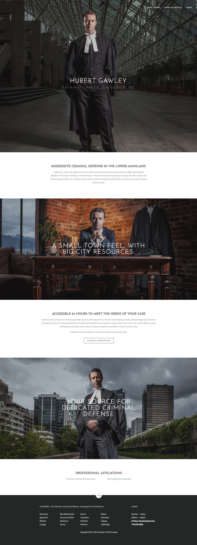
Hubert Gawley
The best photography of the group.
Like the website for Roulston Urquhart Criminal Defence that we featured in our 2017 list of best lawyer website designs, Hubert Gawley looks almost like a legal super hero in the photography utilized on his website. It’s due to such impactful imagery that we really like this site. It’s hard to doubt the impression of authority and expertise of someone who presents themselves like this.
The site design itself is also very straightforward, allowing the imagery to shine through. His site might be able to benefit from a little bit more content relating to his services, but if first impressions are to be valued, that might not be a dealbreaker for someone like Hubert Gawley.
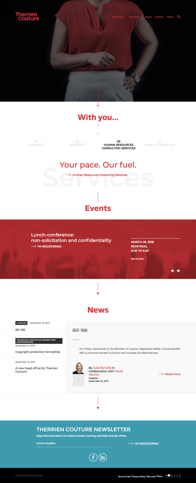
Therrien Couture
The narrative drives this site design.
Therrien Couture’s website features many small touches and design motifs which work together to create a polished final product that is consistent throughout. Many of those touches are introduced right in the homepage header, then repeated throughout the site: the subtle movement in each header image and the vertical red divider lines which draw you down the page.
We also like the idea of allowing users to complete the “I am looking for … to …” statement in the header; most users visiting a lawyer website will be doing so for a specific reason, so this allows users to immediately see an easy to use mechanism that will direct them towards the information they seek.
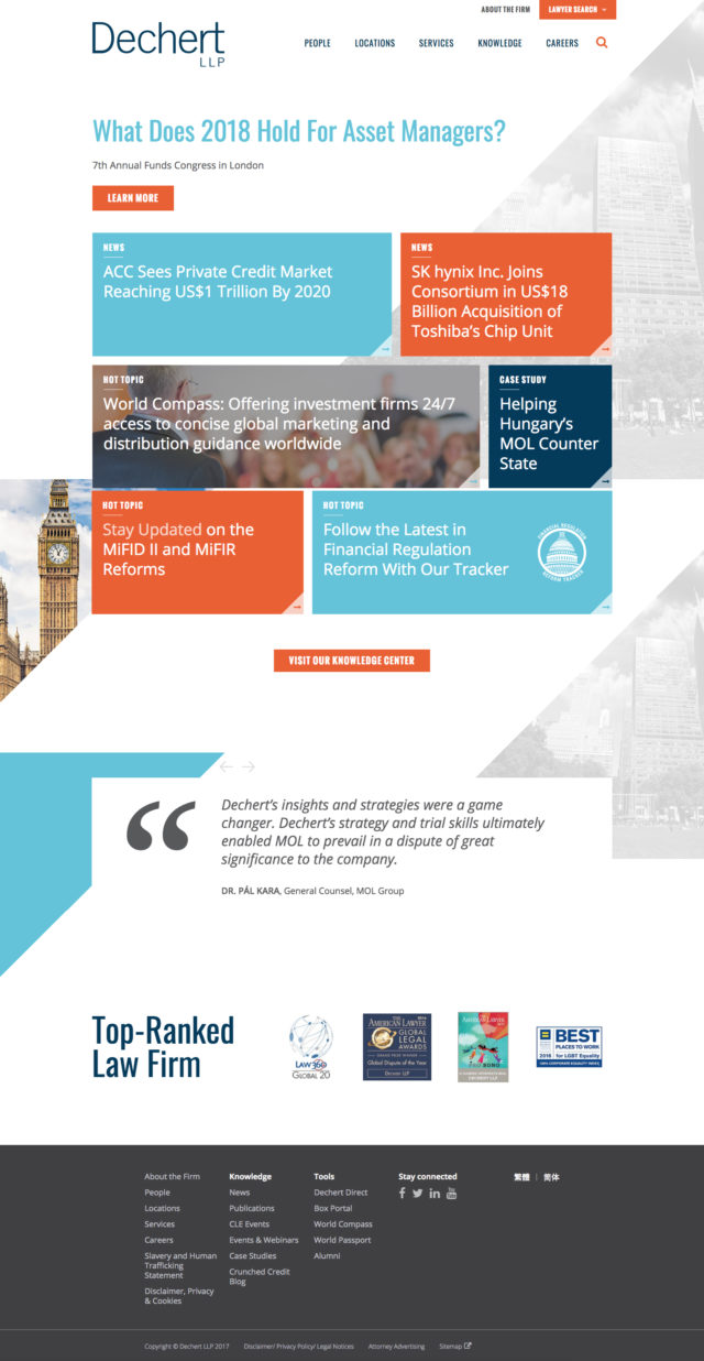
Dechert
Punchy and colourful site design.
Dechert’s website is another example of a law firm website design that places a focus on presenting a feed of new and valuable content to users interested in their services or their field. They’ve presented it in a visually interesting grid design and also presented quotes from past clients and awards they have won below to further validate their expertise.
Honourable Mentions for our Best Lawyer Website Designs of 2018
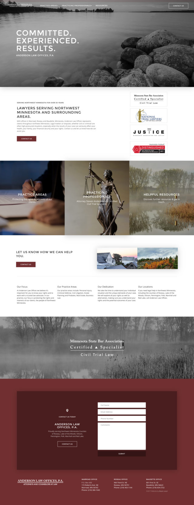
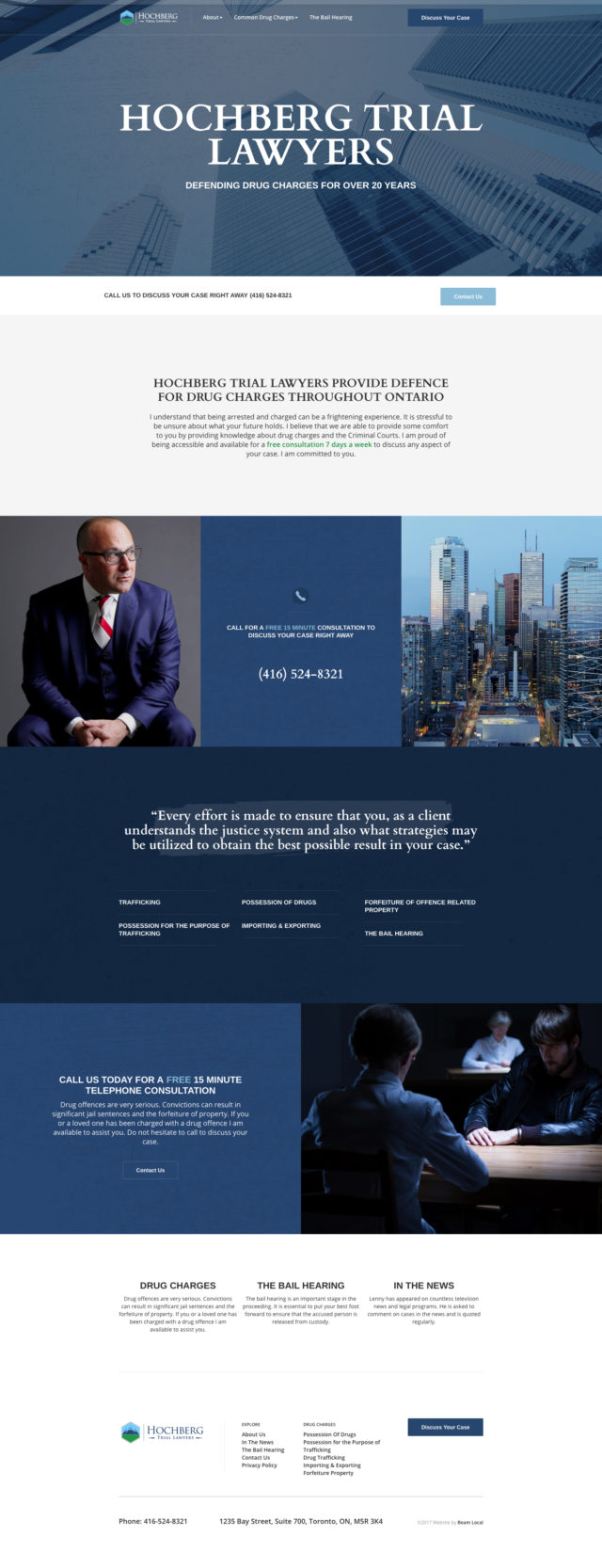
It’s hard to create the definitive guide to the best legal websites without including the following websites below. Special shout out to Hochberg Trial Lawyers and Bankston Law Firm for their fresh and colourful approaches to law firm web design.
Let an expert guide you.
Beam Local helps professionals launch better websites, outrank their competition on Google, and attract better customers for their businesses.
Or Call +1 (855)-831-4530 and Ask for Kyle